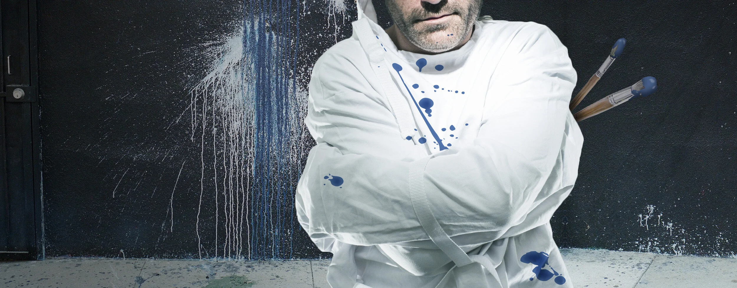
WhatsApp: One More Turn of Facebook's Very Expensive Treadmill
19 Billion is a big number. Dr.Evil big. And like Instagram before it, the WhatsApp acquisition belies Facebook's utter desperation for relevance, and in contrast to pundits' breathless projections, signals a likely end to Facebook's mobile survival.
If you don't work for Facebook, and you're not invested in it, you are probably comfortable considering the obvious signs that the Facebook social network has been revealing a lack of relevance.
As Facebook's users age, and become associatively uncool, the network has become less a place where young, influential, upwardly-mobile users go to "hang out", and more a place where they "reconnect", get updates on high school reunions, and share the occasional cute cat picture with grandparents.
Facebook made sense in a web-browser universe, back when digital social connections were still new, few, and cumbersome. But users don't live in that world anymore, and have increasingly numerous and convenient options for connecting. This has forced Facebook scrambling to find relevance. Literally breaking itself into digestible mobile parts only to find themselves competing with a million other apps with similar attributes.
And it's exactly this desperate scramble that has Facebook blowing 20 billion dollars on 2 mobile apps.
WHATSAPP: ONE MORE TURN OF FACEBOOK'S VERY EXPENSIVE TREADMILL
19 Billion is a big number. Dr.Evil big. And like Instagram before it, the WhatsApp acquisition belies Facebook's utter desperation for relevance, and in contrast to pundits' breathless projections, signals a likely end to Facebook's mobile survival.
If you don't work for Facebook, and you're not invested in it, you are probably comfortable considering the obvious signs that the Facebook social network has been revealing a lack of relevance.
As Facebook's users age, and become associatively uncool, the network has become less a place where young, influential, upwardly-mobile users go to "hang out", and more a place where they "reconnect", get updates on high school reunions, and share the occasional cute cat picture with grandparents.
Facebook made sense in a web-browser universe, back when digital social connections were still new, few, and cumbersome. But users don't live in that world anymore, and have increasingly numerous and convenient options for connecting. This has forced Facebook scrambling to find relevance. Literally breaking itself into digestible mobile parts only to find themselves competing with a million other apps with similar attributes.
And it's exactly this desperate scramble that has Facebook blowing 20 billion dollars on 2 mobile apps.
Mobile is... a perfect storm - one specifically designed to remove dominant players from power.
Yes, I've seen the amazing numbers and projections. Every investor has a slightly wide-eyed, positive spin on the Whatsapp deal, lining trajectories of popular mobile apps next to the web's old guard. But I'm still shaking my head, certain the cards are not stacked in Facebook's favor. Not because the current numbers aren't impressive, but because those numbers exist in the eye of a hurricane. Those numbers only make sense so long as the landscape remains recognizable, the natural laws consistent. So long as we don't acknowledge the inevitability of exponentially disruptive players.
The mobile world is fundamentally different than the one Facebook was born into. The metabolism of business is rapidly increasing before our eyes. There are dominant and unpredictable forces swirling around every business today - let alone those that exist solely on objects of convenience, like mobile apps.
The democratization of development and distribution makes the mobile app ecosystem a whole new world. Never before in history have there been so many competing software developers with so much power to utterly disrupt. The distance between market dominance and failure is now one person, and a day.Add to this that the very existence of an app store as the portal of distribution, concentrates attention on the value of new discoveries. On trying new apps that might be better than, say, whatever you use today. Face it, app stores are like news outlets; old news isn't good for business.
Face it, app stores are like news outlets; old news isn't good for business.
And here you have a perfect storm - one specifically designed to remove dominant players from power. Once you've enjoyed a run, the entire ecosystem is optimized to make room for the next thing.
Take the case of Dong Nguyen, a developer in Vietnam who created FlappyBird. In a few days. Single-handedly. One guy. Unpredictably it quickly became the most downloaded game in the iOS app store, and the Android version, released later, was catching up. Was that predictable? Did Rovio or King see that upset coming? How many people stopped playing Angry Birds to addictively play Flappy Bird? Lucky for them Nguyen inconceivably pulled the app from both platforms. A virtual get out of jail free card for every other contender. But see, it was predictable. Because this is the very nature of the mobile app landscape.Facebook's 19 Billion dollar deal does not appear to take into account the high likelihood - the inevitability rather - that some deceivingly simple upstart app, like WhatsApp and Instagram before it, will come along and do something different, better, cooler. Just enough that it gets attention, gets downloaded, spreads, and eclipses or replaces the old ones.Mobile apps are not platforms, they are disposable instances, they are trends. The sturdy limitations that held Microsoft Office in place for so long do not exist here. Nor are the ones that have continued to keep Facebook warm on the web. Every popular 3rd party mobile app is destined to face an unprecedented, massive and relentless onslaught of unpredictable new ideas from divergent competition.
I'm not sure how many multi-Billion dollar app acquisitions Facebook is prepared to close over the next 5-7 years, but I can tell you with absolute certainty that WhatsApp is far from the last app acquisition Facebook will have to make to retain a position of relevance in mobile users' lives. Far from it. If indeed sheer acquisition of disruptive apps is to remain the sole successful basis of Facebook's mobile strategy - they're on a very expensive treadmill.
Becoming a Director: The Undisclosed Challenge of Creation in a Straightjacket
As professional creatives, as designers, and artists in any medium, staff or freelance, we tend to share a common career goal. After entering the workforce and working in our chosen field for a number of years, we imagine naturally progressing to directing, where we will be inspiring teams of people in doing what we have done. We may further imagine rather loftier goals than that, but surely directing is part of our journey.
Although often eager for this promotion, few creatives understand the implications of directing, and therefor fail to prepare themselves adequately for the role. Let me state emphatically - the hardest thing any talented creative person will ever have to do in his/her career - and truly nothing is fraught with more hidden challenge - is face the moment of transitioning from being a person who makes things, to a person who directs people who make things.

BECOMING A DIRECTOR: THE UNDISCLOSED CHALLENGE OF CREATION IN A STRAIGHTJACKET
As professional creatives, as designers, and artists in any medium, staff or freelance, we tend to share a common career goal. After entering the workforce and working in our chosen field for a number of years, we imagine naturally progressing to directing, where we will be inspiring teams of people in doing what we have done. We may further imagine rather loftier goals than that, but surely directing is part of our journey.
Although often eager for this promotion, few creatives understand the implications of directing, and therefor fail to prepare themselves adequately for the role. Let me state emphatically - the hardest thing any talented creative person will ever have to do in his/her career - and truly nothing is fraught with more hidden challenge - is face the moment of transitioning from being a person who makes things, to a person who directs people who make things.
I have watched and mentored countless creatives through this transition, and at 50 I still continue to face the challenges of this transition myself. As such I can report that upon finding yourself in a directing role, many of you will not be happy, won't be any good at it, or both. At least not for many more years than you expect.And that's because directing is a completely new medium, one that has almost nothing to do with the creative medium you are an expert in. You will (likely) painfully find yourself virtually starting over in your career, you will have to let go of reliance on so many of the expert skills you have acquired, and as when confronting any new medium, you will have to confront the lack of knowing the basics.
Despite expectation and intuition, directing is in no way a natural progression from wherever you are as a creative today.
Despite expectation and intuition, directing is in no way a natural progression from wherever you are as a creative today.
Your Internal Director
As a maker of things, as a designer or artist, your work-flow is often intuitive and non-verbal, you feel your way. It's how virtually all of us started - by making things ourselves, satisfying our inner voices. You form ideas, you sculpt - internally debating, making decisions and solving problems as you feel best, all in the flow, without uttering a word or articulating a thought. If the work doesn't look, feel or sound right, you simply know it at a glance. You don't have to articulate why - you only need to respond to that powerful creative intuition you have developed - trusting your hands, your increasing skills, and feelings to take you to the answer.There is nothing lost in translation at each step because for you it happened organically.
When your work is completed - often you have to step back and analyze why it works. But anyway - in the end it does.So says your intuitive internal director.
Directing: The Art of People
Most assume that because they know how to design or make things that they are suited to direct, succumbing to the illusion that directing is merely a progressive step.However, what you soon discover is that when you direct people in making things you don't get to use most of the skills that brought you here. The tools that you spent 10 or more years cultivating. You soon discover that you're standing there holding a new palette, new tools. The new tools of your trade are interpersonal relationships, the ability to sense feelings, to encourage artists to do what they do, to analyze and diagnose creative, strategic and emotional conditions and articulate them back - all with words. Words. Words.
Words. Words. Words.
Remember that intuitive, internal director? That one who worked so confidently, who felt its way, who, without ever a single utterance, instructed your mind and hands to create stunning works of art? That director must now step out, stand on stage and articulate every thing it thinks and does - with words alone - in such an attenuated way that it encourages this trusting ego, or that passive-aggressive, defensive ego, or the gentle, sensitive ego over there.Every creative I have ever known grossly underestimated the difficulty of this, they mistakenly believed directing was a natural evolution, the next step of being the artist that they are. Which is ironic because, truth be known, a large number of us became artists specifically because we were not good at interacting with people. But despite this, I think most creatives naturally believe they would excel at directing.
We're all quite used to being directed ourselves, and as the receiver of someone else's direction, it just doesn't seem all that hard to do. Maybe in part because good directors and clients appear to do it effortlessly and bad ones (of which we encounter many more) suck such that you can plainly see it, you feel naturally emboldened that you can do better. The problem is, this game isn't doing better than the bad ones. The game is doing it great. And doing it great means , among other things, that you must be terrific at motivating, challenging, inspiring and analyzing people.
Directing Someone Else's Good Idea To The Target
Aside from turning interpersonal relationships into creative solutions, there is another aspect of directing that is often a very new experience: Encouraging someone else's creative voice to occupy the space.
For someone who has come to define his/her aesthetic sensibility through hands-on action, the act of letting go of execution - while still being responsible for the outcome - of motivating someone else to create great work in their own creative voice - not yours, is a daunting challenge.I now know that when the team's work is poor, 9 times out of 10 it's my fault. And when their work is good, 9 times out of 10 it's not because of me. That's directing.
...when the team's work is poor, 9 times out of 10 it's my fault. And when the work is good, 9 times out of 10 it's not because of me. That's directing.
And it's not because we, as directors, don't occasionally have good creative ideas, but because the director’s tactical creative solutions are not those that finally manifest. Sure you inspire, and guide and you might even get the team to design down a path that you originally conceived, and you are ultimately responsible if the work sucks. But the work, the image, the site, the art is not yours. It can't be. The artwork simply is somebody else's - and it must be allowed to be. It has to come from their heads. They hold the brush, and their heart needs to move it.
There is a close corollary when directing film and theater actors.
A bad theater or film director will give his actor a "line-reading". This is when the director acts out dialogue from the script by speaking with specific emphasis, and then directing his actor to repeat the line with that emphasis. This is micromanaging, forced, and does not result in a realistic, believable performance.A great film or theater director will never have to tell an actor how to say a line. That does not mean that he won't manage to get the actor to say the line differently however. Our hypothetical great director will sit down with the actor and discuss the character - he may revisit the character's back story, the impact some event must have had on the character's current emotions. A dramatic event, the context of the scene. The director may further sense a personal conflict in the actor himself, one the director must emotionally counsel the actor through. Armed with that context, feeling, and emotional therapy the actor is then able to do his job - to lose himself in the real emotion - to use his own instrument to become the character. When the actor is truly in character - when he believes what he says - with the emotion of his back story in his heart - the performance will feel real- and it will be consistent. And any emphasis on that line of dialogue, and all the others, will come from the actor alone.
The same is true for all great directors, no matter the medium. Designers need to understand the goal, the intent, the strategy, the feelings that the piece needs to convey. The artist will likely need emotional counsel from time to time- sensitivity to the challenges she faces. And the director must trust the voice of that good designer. If he does not, if he says "do it like I do, do this, do that", if in exasperation he sits down and creates a piece of art to show his designer what he means, he is essentially giving his designer a "line reading", he is cheating. And he is undermining his designer's ability to be great, to do the best work she can do.
...if in exasperation he sits down and creates a piece of art to show his designer what he means, he is essentially giving his designer a "line reading", he is cheating.
Often new directors gravitate back to their creation tools. Simply because sometimes it is how they think. It's how they have grown up communicating. The art-making tools are a young director's comfort zone. Even if you don't think that's why you're doing it - it is usually the reason. It feels safe. You know where you stand when you wield photoshop or whatever your tool is. You have power there.
But when you let go, when you donn the director’s straight-jacket and try to merely talk... well, what does one do? How does one "create"? If the work isn't right, how does one get the team from point A to point B? How does one get the artist to change the art without telling her what to do? Does one repeat the original direction- again? Does one simply reject bad ideas? Does one compromise? Does one make forms, or charts, or plans? Does one come up with ideas for off-sites to motivate the team? Does one make sure everyone has the best equipment? What's the job?The idea that the director's contribution has little or no physical deliverable is often an alien sensation to someone who has been promoted from making things.
Skills and Credibility
With all this talk about "hands off" I hope I haven't misled you to believe that a director does not need a solid foundation in the hands-on skills in his background. Having watched so many directors from different fields and backgrounds, I've come to realize that those who have done the work before, who have solved problems like these many times before, who might otherwise be able to sit down, take up the tools and do this job now, these directors are almost always better. (Again - assuming they apply the knowledge - but withhold from doing it!) They know what their team is going through. A director who lacks such direct hands on skills neither understands the nuanced challenges his team faces, nor does he tend to command respect and belief from his team. The extent to which the director or client has not done this type of work is the extent to which the creative team will likely doubt the integrity of any direction he has provided.It's why clients and directors who lack creative or hands-on backgrounds but who provide creative comments are notoriously lampooned and ridiculed by creatives in all fields.Authority without experience. Creatives are a cynical lot. And few things trigger their cynical response more than an inexperienced client or director giving feedback.
Creatives are a cynical lot. And few things trigger their cynical response more than an inexperienced client or director giving feedback.
And this brings me to the last main challenge for most directors.
Navigating the Corporation
Even the title triggers measured sighs and eyes to roll. But this is another arena that often comes as a shock, and where great directors can excel.
Almost all creative jobs exist within a company. Very few of those - even among ad and design agencies - are truly designed to nurture creatives' needs, disciplines and sensibilities. And it's here, in the organizational world of profit and loss, of business plans and strategy, of budgets and Excel spreadsheets that the last few creative directors sink or swim.Nothing elicits such a strong show of cynicism as when corporate machinations impact the creative team. If you run a company you are all to familiar with the fear, uncertainty and doubt that seems to plague your design teams. You feel they often make unrealistic demands, disconnected from what it takes to run a business. They complain when things change - they always seem to look on the dark side when the company grows or changes - never seeing the positive.
But you need to know, your creative teams are not just irrationally "whiny". They behave this way because creatives, by in large, really are victims of the corporate world.
creatives, by in large, really are victims of the corporate world
See, the reason creatives enter the fields they do is because they were designed for that. It's how their brain works. And being designed for that often (though perhaps not always) means not being designed for other types of roles: strategy, management, accounting, and sales for example.Unfortunately for creatives, creating great artwork does not automatically explain or justify its benefits to the business. The disciplines and skills involved in being a great creative does not make one great at conceiving and arguing for organizational change that will both improve the work they produce and also make the company more money.
Not the way, say, salesmen can. Or strategists can. These guys can assemble a compelling argument, compare the numbers - they can argue and show how the bottom line will improve by funneling more money and resource to their departments in ways that make their lives easier and allows them to do better work. They are verbal creatures. They think in quite literal, logical terms. And they can sell in their ideas. Their job skills actually align with organizational operation.
But creatives generally don't have those skills. They are intuitive thinkers. They have feelings that manifest through their hands into objects and artwork that none of the rest of us can fully explain but that we love and appreciate.
So it goes that when things happen in a company - when teams move, get reorganized or budgets and schedules are allocated, the creative team is carried along for the ride - in whatever way some executive, armed with reasoned arguments from other articulate teams, decided was best. Often this results in non-optimized conditions for the creative teams. When they are lucky the creatives have a team of executives that look out for them. But this is most often not the case.
So creatives the world over are literal victims of the corporate system. And they act like it.
This is where a solid director has an opportunity to make a difference. Navigating the corporate world - selling into the business - justifying the need for greater budgets, schedules, resources. And defending the creative product itself in the face of dissension.If you can do all this, your creative team will do better work - and to me there need be no more reason to do this part well.
But what exactly does any of this have to do with that wonderful creative skills that brought you to this role?
Very little indeed.It's just another unexpected challenge that most directors discover after the fact, and struggle against for years.
Love What You Do
Like all things the transition to directing often eventually works itself out if you enter with your eyes open - aware of these otherwise hidden factors, and remain committed, always willing to learn a new lesson.Mainly though, and I'm sorry if I sound like a broken record, it's important to be aware that directing is not a natural step in the progression of your role as an artist.If you love your art, if you love designing - if your heart thoroughly enjoys the skills you have developed, my emphatic recommendation is: don't be too eager to leave that behind you. Because in many ways - that is what directing results in.
Conclusion
To recap, there are four main qualifications you'll end up confronting, if indeed directing is your calling. You'll have to:
Know the art and have mastered the hands-on skills. If you can't make things yourself, if you haven't done it before - you don't really know what your team is going through - you're guessing - and therefor can't direct well. Having these skills behind you is how you will relate to your teams, how your feedback will carry credibility, and more importantly how you will gauge what they are and aren't capable of.
Become an expert in interpersonal relationships. People are now your medium - where the art form itself no longer is. You must be able to read people's concealed emotions, you must intuitively know what they need from you and from others to do great work. Your own ego has little place here. You must have nothing to prove, you cannot be defensive. You must be a therapist and a leader. If this one qualification doesn't come naturally to you - directing may not be up your alley.
Direct with context and words, not "line-readings" and hands. You must be a strong speaker - you must be able to form and articulate thoughts that are valid and make sense. You must wear the director's straight jacket, able motivate and redirect your teams without doing their jobs - they must be allowed to own and invent the solution. They must be allowed to create the art. If you do it for them, and it does not manifest from their consciousness, they're ongoing performance will will be weaker.
Navigate the corporate organization. You will have to defend your team's creative ideas in such a way that clients, and executives can buy in to the creative executions. This is about much more than the "pitch". You need to be able to explain to them how it improves their business. You need to defend your team when corporate changes are likely to impact them. You need to be able to wrangle the corporate machinery to your team's best interest.
This is directing.
It's all about the art - but the art is not your medium. Now your medium is people.And that is why, creatives who've advanced to directorship often find themselves longing for the days that they were making things again.

Crank My Projector: The Embarrassing Overuse of Scroll
If you want to identify an embarrassing trend that will iconify outdated, wrong-headed web design circa 2012 - 2014, you need look no further than this.
Though probably not in the way you expect.
For the better part of 2 years, and largely ushered to popularity on the back of scroll friendly platforms like iPad, scrolling has become one of the most useful but sorely abused and overused interfacing tools available to web developers today.
CRANK MY PROJECTOR: THE EMBARRASSING OVERUSE OF SCROLL
If you want to identify an embarrassing trend that will iconify outdated, wrong-headed web design circa 2012 - 2014, you need look no further than this.
Though probably not in the way you expect.
For the better part of 2 years, and largely ushered to popularity on the back of scroll friendly platforms like iPad, scrolling has become one of the most useful but sorely abused and overused interfacing tools available to web developers today.
Like a lot of people I breathed a sigh of relief when it became clear that the tide had changed and the dark ages of "above the fold" had lost a fair bit of its gravitational strength. That scrolling had finally osmosed its fair share. Always important, but more articulately understood today than years past, the fold just doesn't have to work as autocratically as it used to.
Today, scrolling enjoys unfolding and metering stories and arguments as it was intended.
That said...As often happens in the world of interactive trends, when they get an inch, they take a mile. And for script-gimmicky developers (undoubtedly suffering from Flash withdrawal) scrolling has entrenched itself as one of the industry's latest misappropriated novelties.
Site creators have long embellished the basic scrolling function by creating parallax effects - where layers move at different increments; sometimes to create subtle, pseudo 3D effects.
And I bet you thought these were the sites I meant to deconstruct. Well, not today. The parallax effect is admittedly overused, but it's generally ambient, and doesn't overtly undermine the UX or content it carries. Despite parallax, users still scroll as expected, content may be consumed as intended, and no one is unduly surprised or confused.
The parallax effect is admittedly overused, but it's generally ambient, and doesn't overtly undermine the UX or the content it carries.
No, today I'm talking about the sites that take it further. Too far. To the point of utterly undermining the content and user experience. These are the most embarrassing of acclaimed executions.
These executions are characterized by something I call the "scroll-powered movie". Projects where the scroll function is employed to advance lengthy animated sequences to tell a story. And it's my opinion that use of this technique reveals a weak understanding of the medium. Here are some random examples. But you've seen many more of these.
Example 1 Example 2 Example 3 Example 4 Example 5 Example 6
Naturally, they even win web design awards.
I'm regularly bemused at the poor judgement web award groups display in selecting sites that are so clearly off the path to our future. It leads me to believe that these organizations have little in the way of a philosophical understanding or stance on interactive language to inform their decisions, instead apparently basing their awards on the interactive equivalent of "ooh shiny".
astaire
The Quest for Consistent Speed
As long as mankind has had the ability to record time-based images and sound on a medium that could be stored and played back later, we have well understood the need for a consistent, repeatable playback speed. Record players, tape recorders, movie cameras, projectors, VCRs and even video codecs all had the same dependency on consistent playback speeds.If the speed of playback was not identical to the speed of the recording, content was presented inaccurately.In analogue audio, playback too fast and you got the chipmunk effect (increased pitch and tempo), too slow and you sounded like James Earl Jones. On film the well-paced dramatic scene would lose any dramatic tension as the characters zip around like keystone cops. Even worse, inconsistent speeds result in all manner of warbling and stuttering. And with rare exception (say, the specific intention to poorly reproduce), none of this is "good".
But welcome to 2014, where such past obviousnesses are overrated - hey, we're in the future now, right? We use computers. Lessons from the past have no relevance here.
/sarcasm
Interactive, at its "true-use", is not about linear, prerecorded experiences. It's an art form based on gesture and response.
Even so, we often consume linear content within the context of an interactive experience.
And it's here, between interactive design, and linear self-play, that so many site creators continue to struggle; failing to find rational hand-offs between these sometimes opposing concepts.
And it's here, between interactive design, and linear self-play, that so many site creators continue to struggle
This struggle is iconified by the scroll-powered movie.
Despite its rampant popularity, the scroll-powered movie never (ok, rarely) serves a useful or even aesthetically superior purpose. In fact, as I will show, it usually diminishes the value of the content provided in these pieces.
(I say rarely, because there can be practical uses of the interaction, if, say, the user were enabled to carefully analyze motion or footage to some practical or aesthetic end: for example the way a film editor scrubs video to find a specific cut point. The problem is, the vast majority of acclaimed instances of this practice are not of this rational sort.)
How it Breaks
The scrollable "movie" contains a story, sequence, or idea that is expressed via a series of frames, or positions that were intentionally designated - laid out at specific increments or percentages from one another - to create a meaningful sequence.
But the careful relationship of all those increments and percentages are ultimately worthless in random users' hands.
A User is in the habit of scrolling however he or she prefers. Fast slow - jerky, smooth. And scrolling further dictates highly variable speeds from device to device, and from system preference to system preference. So immediately a wildly unpredictable "random speed generator" is introduced. Other technical functions play a role here too - browser, processor speed, network, all sorts of things impact the ramp up, momentum, speed, smoothness, and stop points of the scroll function. In short, there is an absolute guarantee that scrolling speed and action will be wildly unpredictable.
And yet all of that was generally functional until our young creator got the bright idea of tying those unpredictable variables to the speed and progression of his linear movie.
The comical result of this brand of "experience" is that users inch, inch, inch their way through some linear animated segments that would have rather benefitted hugely from consistent, smooth action. And at other times unpredictably zip through, skipping and stuttering past important segments, wholly missing key ideas and moments and losing all sense of dramatic pacing and timing.
To these site creators one might ask: what did you think you were giving the user control of, and to what end? What value has the user derived?
The lesson we need to take away from this kind of UX failure is that we must rather functionally honor the true nature of our content.
The lesson we need to take away from this kind of UX failure is that we must rather functionally honor the true nature of our content.
If what you have conceived is a linear movie - one that utilizes lengthy (more than binary or iconic) animated sequences to tell your story, then honor the inherent nature of that, embrace the linear "movie", and let the machine manage your ideal speed and pacing. With rare exception your linear story is never going to be improved by handing your user an inconsistent, kludgy interface, and saddling them with the job of managing consistent and smooth playback; in short, to be your virtual projector motor.
There is nothing wrong with letting a movie be a movie. It's how you handle users' potential desire to interrupt it that matters.
Embracing Linearity - A Successful Variant
Despite the failure of these continuous scroll-powered movies, there is a different scroll-based movie model that does work, one that more effectively utilizes the function to advance linear sequences.One of the most iconic of those today is Apple's Mac Pro site.
Here the true, linear, movie-like quality of a number of discrete animated segments is fully honored - even while the user is given the freedom to advance or back up within the greater story. In this case scroll is used as a trigger - instead of as the virtual motor. In this case, scrolling simply triggers an animated sequence, which is then displayed (powered by the machine) in as smooth and consistent a speed possible, until it comes to rest on a predetermined idle point. Although users might initially disorient as control is temporarily wrested away, the feeling is only initial and momentary. Here, one discovers that scrolling has become a page-turn or "next" button.In this first "scroll-as-trigger" model the vertical response we are accustomed to does not exist. The subject (a Mac Pro) appears to exist continuously on screen animating in arbitrary ways, somewhat in contrast perhaps to the expectation of scrolling up and down.
But closely related to this is a second model where the act of scrolling rather does move the subject up and down, but in a semi-automatic way, and here again, in a triggered, page-turn, manner.
The system, once instructed by the user to scroll, ignores the user's increments, and does the work of setting the speed and stop point of the scroll - usually ending when the next "fold space" is aligned perfectly in the browser window.
While I am not particularly an eager fan of the latter two techniques, they do represent sensible alternatives to the page scroll function, and can enhance the UX.But this of course is in contrast to the embarrassing scroll-powered movies employed by so many site creators today.
The time will come, and for some perhaps that time is now, that we will look back on these years of scroll-powered movies, roll our eyes and wonder with embarrassment what the Hell we were thinking.

Why I Prefer Closed to Open
The best work starts with an idea, a visionary seed, one that must be defended and guided through the myriad of decisions a project meets along its growth.
I often think of creative ideas like trees in a forest. In a forest, the trees that stand out, those that get your attention, that make you stop and marvel, those are the trees that are unusual in some way. The ones that defy the average vertical pattern. The tree that is bent and twisted against the norm. A tree that quite literally goes out on a limb.
Why I Prefer Closed to Open
The greatest creative expressions are the direct result of an individual's inspiration, vision and guidance. It may take a mammoth team to execute on that vision. But the best work starts with an idea, a visionary seed, one that must be defended and guided through a myriad of decisions a project meets along its growth.
I often think of creative ideas like trees in a forest. In a forest, the trees that stand out, those that get your attention, that make you stop and marvel, those are the trees that are unusual in some way. The ones that defy the average vertical pattern. The tree that is bent and twisted against the norm. A tree that quite literally goes out on a limb. This tree is not average. To some, this tree may seem awkward, or ugly. To others it is unquestionably the - one - beautiful stand out.
At this point some feel compelled to point out that the forest - made up of my average trees - is itself a thing of beauty. And indeed that is true - but taken at that scale, the forest then is the unique, unusual object against a larger experiential backdrop.
Either way, our tree is its own. It is unique.
Such uniqueness is only possible because it was subjected to a one-of-a-kind force or condition that the other trees were not.
If however, you averaged the shape of all the trees in the forest, the unique beauty of this one unusual tree would be lost. Averaged out.
In development of creative ideas, void of an individual's guided vision, the more voices, the more inspirations, the more filters, doubts and preferences that collide and direct, the less distinct the eventual expression becomes. A variety of inspirations naturally cause a canceling effect. An averaging of the distinct, unique exceptions. They pull the limb closer to the middle, closer to an average. It's a simple truth.
And this is how I think of closed Vs open.
It's why artists tend to prefer a closed condition. It allows for authorship - for an individual's vision. For expression of (potentially) a truly unusual, unique idea. One that goes out on a limb. One-of-a-kind.
There are often many flaws and possible pitfalls in the structure of closed projects. Being non-standard, they are more often prone to systemic deformities and challenges. But this is why the whole process, the whole team must be working in agreement to support the originating vision. Because more technical rigor is required to overcome this natural weakness - to ensure the integrity of the unique structure. While each member of the team has a role that will impact the project, still above all directives is the one that defends the vision.
This is not to say that Closed is naturally superior. Open has its own benefits.
An open project naturally resists many of the risks of systemic deformity. In fact it excels at evading deformity- errors. It more easily reveals and repairs structural flaws and more readily results in a functional system. But what it more easily gains in structural integrity, it gives up in uniqueness, in surprise, in drama, creative integrity, and delight. It is merely a tree - out on no limb. Standard, functional, and utilitarian.
And it's why so many of the engineers I know prefer an open environment. Not all, but most. It is sensible if your aim is above all to ensure technical integrity.
I don't mean to split artists and engineers, that's a generality and not entirely fair. I've known rare exceptions on both sides.
But to me, all this does ring true when I reflect on debates and sensibilities surrounding iOS and Android.
When I use each system I can see the difference in the originating process and sensibility.
My experience with Android is one of utility and functionality. It works. And for some that utilitarian functionality is plenty. It's preferable even. These people look on the unusual bends and twists of iOS and they see flaws, a focus on gratuity that feels odd and unnecessary.
But an open system will never surprise you. It will function rationally, but it will not surprise and delight.
And to me - my heart drops when I use Android. It works, yes. I get from point A to point B. But (heavy sigh) I don't enjoy it. There is no joy. Perhaps acknowledgement of this is part of the reason Google has been taking a more "closed" approach to parts of Android.
Users of iOS, and all other Apple products, I think generally appreciate the ongoing lengths Apple has gone to engineer and fortify its twists. The obsessive attention to detail that make Apple products surprising, delightful and unique. Apple is the very product of going out on a limb.Creativity requires a vision. A great movie, a pointed work of art, a gripping book, a great design, a delightful OS experience, all require a vision. And these further require strong direction and leadership - on whatever scale may be relevant. There are easier ways to create - but none that result in strongly differentiated creativity. Great creative expressions are not originated by communities. Executed, perhaps, but not originated and directed.And for this reason I assert, with exceedingly rare exception, outstanding creative expression is the result of a closed model. And it's why I prefer the closed model myself.
Google Glass Is Not About Hardware - The Solution Rests on Software Alone
There is a reason the word "face" is found in "interface". Your face (and its senses) is the primary conduit through which you receive information. And when we talk I tend not to look at your elbows, but at your face, since most of the information I receive comes from it. In addition to verbal responses, your face communicates non-verbally - where your elbows for example, tend not to. And this is why Google Glass, as conceived today in hardware, is doomed.
In sitting persistently between the world and your face, Google Glass screams self-centeredness, persistently communicates contradicted attention, and confirms a flip in the social subtext from "occasionally about me" - to "always about me".With a design that belies an effort to both persistently engage but not interfere at the same time, Glass appears plainly two-faced and is predictably regarded with social suspicion.Proponents of Google Glass will argue that Glass - by virtue of it being persistently available - will reduce the annoyance others experience when you look away to your phone, or maybe, someday, your iWatch. That pausing a conversation to look into space, up and right, at an email is somehow less intrusive.
But that's ridiculous.
You call on these other devices only as needed, and yes, it's always slightly annoying to have mutual communication interrupted by a glance at your phone. But I can assure you, it doesn't solve the problem when you mount your phone over your right eye. At least you can put those other devices away and once again plainly give yourself back to our communication.
Despite the many flavors of self-centeredness ushered in by digital technology, few consumers, no matter their age, will be willing to outwardly don such an obvious "fuck you, I'm actually all about me" to the world.
For this reason, Google Glass will never work - it will never be adopted en mass - until it fully fades from view. Until you, the wearer, no longer broadcast utter self-centeredness to all passersby.
Even a telltale bump and lens on your tortoise-shelled Warby Parkers will not save you the heavy-lidded eye rolls (that's Mime language for “Jesus, one of these guys”) and sudden camera-shy self-consciousness that the Google Glass wearers I know are encountering today.
Until such time that Google Glass recedes into invisibility, until there is no outward evidence that you are a Google Glass wearer, only then does the technology stand a chance of penetrating the greater world.
And only then will the real product design problem start.For when aesthetics of the physical device is no longer a consideration, the entirety of the experience becomes a software problem.
For when aesthetics of the physical device is no longer a consideration, the entirety of the experience becomes a software problem.
And on this point it seems to me that Google Glass software with its slightly kludgy behavior, mediocre design, and limited overall experience is a very, very long way from the target.
I remember when Steve Jobs demoed the iPhone. Do you remember the shocking fluidity of the interface? What it did seemed like magic. It was delightful and seemed some factor more sophisticated than every other device you'd ever used. It solved problems gracefully and with striking originality. It was at once charming and incredibly hi-tech. The physical form-factor was great at the time which was necessary considering its handheld status, but the real story was how it behaved. The software experience.
Had he demoed iPhone, with software that was merely utilitarian and lacking in surprise and delight, had he dumped responsibility to invent a delightful user experience on the developer community, rather than leading with one, no one, aside from a few geeks, would have wanted it.
And that's exactly where we are with Google Glass.
We have a long way to go. The hardware has to recede starkly to make up for its current social failure, and the software experience has to balloon into something profound.In the meantime Google is now jumping through hoops with Warby Parker. But I don't think it will matter. They'll probably try to make Glass look like real glasses, (hopefully for them fat, chunky geek glasses stay in style a little longer) and maybe that will go some distance in making the tech a little less blatant. But the second you catch wind of a battery pack and a camera - it will start all over.
Whatever the specific brand of industrial design applied to Google Glass, no matter how fashionable the obscured right eye, it will not play the slightest factor in the future of a successful solution.Delightful software is the product, the sole playing field on which augmented reality will succeed or fail. Software so great that you'll want it everywhere you go.
Because that's all anyone will ever see.
Your App Should Not Look Like iOS7
In reading the frenzy of reactions from bloggers across the web to the design changes in iOS7, I have come across a sentiment that I believe is misguided.
Basically the message goes: "iOS7's UI is flat (etc.) to focus on content (etc.), and if you don't make your app flat (etc.) to focus on content (etc.) too, it won't look 'at home' in iOS7, it will look old and nobody will want it".
I'm paraphrasing but that's basically it. And I refer only to the belief that the aesthetics need to conform, that it needs to look more like the OS. I am not referring to functional adaptation.
Some of you might take issue with my use of the word "flat" (Vs deep or whatever). I know, that's incomplete because iOS7 is layered with its illusion of depth, light and materials. That's an important point - and I'll get to that. But for now I'm talking about the general practice of removing everything from the UI that doesn't communicate functionality, and of the focus on graphic minimalism.
Before I explain why that message is misguided, let me say - I love most of the aesthetic changes in iOS7. I think it's a handsome, on-trend and functional design update, with some niggling exceptions that others have done a fine job addressing (font issues, icons - some of which are already improved), and I expect it will just keep get better in coming releases. I am generally a fan.
Although this flat, minimalist movement is based on a rational devotion to better, more communicative UI, and I suppose seems truer in some pure UX sense because we have essentially moved closer to the very wireframe, "flat", as it is being advocated, is still just a design trend.
And as with all design trends, "flat" will have a popular lifespan, following which, it will fade.
One of the main points I want to make is that this "flat" UI minimalism will go stale quite a lot faster than previous interface design trends, I believe, for two primary, synergistic reasons:
Because we have such an uncommonly concentrated community of app designers in the iOS ecosystem that trends get identified, and adopted en masse at increasingly rapid rates, but more critically.
Because the very nature of flat design, or rather, of minimalism, is the provisioning of a vastly reduced design palette. A palette that, by design, offers far fewer areas of adjustment which are rather defined by attention to detail and subtlety; the restrained, disciplined modification of the most basic UI building blocks.
So as more designers than ever are working with fewer design elements than ever, together, these factors will result in a sudden commonality in design across apps. Frankly, if you watch for these things, you know it's already happening on the web (the Squarespace Syndrome). And with it comes a lack of clear differentiation. Indeed, I argue, minimalist app and web design will run to a type of commodity.
So as more designers than ever are working with fewer design elements than ever, together, these factors will result in a sudden commonality in design across apps.
As soon as this realization hits, that their apps are homogenizing (and it will hit) designers are going to start looking for unique ways to move past this commonality. They will start to add, and embellish. They will expand their design vocabulary and re-embrace varying degrees of gratuity.That said, and perhaps thankfully, the best of them will not revert back to the pre iOS7 trends.Like most shakeouts, the focus on minimalism in app design has been healthy; it's bringing the developer community closer to understanding the rigor required for working with type and layout, of prioritizing elements, of limiting the palette to better communicate. And hopefully that awareness will remain.So what form will the "new embellishment" take?
Virtually all of my designer friends are talking about a new "Maximalism" (half-jokingly perhaps, but that's how these things start) as a way to break through this inevitable homogenization. I've heard half a dozen rather cool ideas that push past the current focus on "flat", moving forward in a new direction - adding back elements that are, once again, completely gratuitous (and sometimes functional) in a new way. If joyfully so. These will be new, surprising elements that are, under the current flat dogma, "unnecessary" and "distracting", allowing for random surprise and spontaneity - where rigid minimalism is clearly challenged.
But, I think many of the minimalist designers looking at iOS7's UI aesthetics are mistaking the larger challenge as a graphic design problem. Dribbble is teaming with designers who are offering up alternative "flat designs". A point that in some way reveals a basic weakness in the Dribbbles of the world - that these groups focus inordinately on the graphic layer. On how a UI looks.
a basic weakness in the Dribbbles of the world - that these groups focus inordinately on the graphic layer. On how a UI looks.
Whereas the vast majority of designers I interview barely focus on how an interface behaves. And how a UI behaves - how it responds - the alchemy of interaction, that is "interactive design". A mere portion of which is graphic.
Now, if you look again at iOS7 you can see that Apple is acknowledging this. In those parts of iOS7 that the staunch minimalists are having such an allergic reaction to, things like parallax on the home screen, and wiggle of the text bubbles in iMessage. The so-called "flat" graphic design is there, yes. But it sits within an interactive design that, while restrained, is not minimalist at all, it's embellishment. But it's also delightful, and surprising.
This is one of the ways design complexity will necessarily reassert itself through the minimalist homogenization.
For me the main take away here is recognizing that one can honor the rigor that design minimalism has forced to the table - even while one expands the vocabulary. Where "Flat" maybe reduces to a kind of baseline, a jumping off point.
But I think we all need to find our own unique approaches.And I guess that's my parting thought. That I don't believe the answer is to just jump into the specific iOS7 design approach as though it is some sort of ideal design guideline. In fact, depending on your app's function or audience, it may even make perfect sense for your app to be utterly, cartoonishly skeuomorphic.
Namely because, from where I sit, the world of communication and UX is just way, infinitely bigger than iOS7. That's just what Apple did - with the platform. Ok. I'm glad they did it, it is an improvement over the previous. But surely you have something to say that is different. Surely your content - your idea - your app - is a unique invention of its own. Surely it wants to be itself. Sure it does not need to look just like it belongs inside the OS.
But surely you have something to say that is different.
I mean, if a platform with one aesthetic approach always dictated the form of its content, what would that mean for, say, movies? Is it better if movies all self-reflectively share the aesthetic approach of the theater interior, or maybe of your home? I know that's ridiculous, but I guess I feel like reflecting design choices of iOS7 is just some percentage less ridiculous. The trees you notice in the forest are the ones that are bent over funny. The ones that are unique. This is where I completely lose the rationale for following Apple's design solution in the development of apps. I get that there are best practices, and a basic growing language that we share in the interactive space. But the point should not be to copy or align with Apple's design approach. It should be to honor your unique vision. Learn from the masters, of course, embrace best practices, but where aesthetic choices are open to you, strive to find your own voice.
UPDATE
I know that some strong thinkers out there agree with Tapadoo, like John Gruber, who linked to the post above, and with whom I almost never disagree. So I must say - it's left me scratching my head. Because on this, I do fundamentally disagree that updating your app to "look like an iOS7 app" is even remotely as urgent as updating an app to accommodate the larger screen of the iPhone 5. Not even close. With the iPhone 5 the screen was bigger and your legacy app looked broken. Of course any app needs to work, and by "work" I mean the app needs to adapt to the new system's basic technical and functional conditions. So I guess, yes an update is necessary, but where we are talking about aesthetics - of "looking like iOS7" - no, following such a design trend is not necessary.
UPDATE 2:
John Gruber graciously answered my question:
"I use iOS 7 as my main OS on both iPhone and iPad. The non-Apple apps stuck out like sore thumbs. They don't even have the new keyboard.
"I'm not saying all apps should look just like Apple's. I'm saying only that they need to look and work like they were designed with iOS 7 in mind, and they need to be updated with the new SDK. That's all."
Agreed.

Google Glass Vs Recon Jet - The Difference is Context
Those of you who read this blog know I reflexively roll my eyes and exhale heavily any time the topic of Google Glass comes up.
And yet here I am today pointing to a similar product that I think, in principle, stands a chance. At the very least, if too niche to change the world, it makes functional and practical sense to me. Which is a lot more than I can say for Glass.
In fact when I saw Recon Jet (and Recon HUD) for the first time I didn't cringe in sympathetic embarrassment for the person wearing it, as I do when I see some bozo wearing Google Glass. It's not because I am particularly drawn to the design, or any particular feature. Rather, it's because the person who wears Recon Jet, as designed and marketed, arguably has a rational reason to wear it. The same reason he might also wear a helmet and shoes with clips.

Recon Jet
Google Glass Vs Recon Jet - The Difference is Context
Those of you who read this blog know I reflexively roll my eyes and exhale heavily any time the topic of Google Glass comes up.
And yet here I am today pointing to a similar product that I think, in principle, stands a chance. At the very least, if too niche to change the world, it makes functional and practical sense to me. Which is a lot more than I can say for Glass.
In fact when I saw Recon Jet (and Recon HUD) for the first time I didn't cringe in sympathetic embarrassment for the person wearing it, as I do when I see some bozo wearing Google Glass. It's not because I am particularly drawn to the design, or any particular feature. Rather, it's because the person who wears Recon Jet, as designed and marketed, arguably has a rational reason to wear it. The same reason he might also wear a helmet and shoes with clips.
As an athlete, he's fully engaged - physically and mentally. There is nothing casual about pushing your body to its limit. If you're serious, it's fully consuming. Needless to say, if both hands aren't busy, you're not trying hard enough. A person so engaged might therefor benefit from some way of accessing data as he optimizes his ride and behavior.
Contrast that with Google Glass' proposed casual meandering down the street holding a Latte. The other hand probably carrying an Abercrombie and Fitch bag which holds a baggy shirt labeled "Muscle Fit".
That's the difference. Google Glass lives in the world of casualness. Recon Jet lives in the world of purposefulness.
I know, I know, those of you who want a pair of Google Glasses, don't get this, you draw a timeline from your phone to Google Glass as though Glass were some logical extension. But that line you're drawing (which may be valid someday - once the device operates effortlessly and doesn't dominant your appearance) is narrower and frailer than the immediate, overt line connecting Google Glass to your face - and therefore to Maui Jim.
Basically - you don't need to wear your phone over your eye when you're casually window shopping. It's gratuitous. The decision to wear Google Glass is therefor rather a choice of preference, of style.
And that's what makes Google Glass so overtly lame. Because it is, like it or not, also such a strong fashion statement.

“She almost looked at me. That’s right, I know where the nearest Starbucks is, baby.”
Recon Jet easily hurdles Google Glass' utter fumbling of fashion sense by making it not about that any more than the helmet or pedals are. The self-conscious dopiness that comes pre-packaged with Glass, is not evident here because, as athletic and emergency equipment, Recon Jet has a defined purpose that fits a solid, if temporary, real-world need, and is therefore subject to different design references and expectations.
And I groan inwardly to accept this, but maybe that's how such a device might cross over into the mainstream - someday.In the same way that the athletic authenticism of high performance running shoes eventually informed the daily choice of out-of-shape people everywhere; a sort of ubiquity that bred acceptance of the design approach, so too might the iPatch form factor work it's way past geekdom.
Needless to say, in the meantime, if you wear your Recon Jet while shopping for your Chihuahua's new food bowl, expect to get laughed at behind your back just as much as you do wearing Glass.
Recon Jet may seem like Google Glass in many ways - but there is one major, all-critical difference - Recon Instruments knows why such a form factor might actually be necessary. And in this case, the context is everything.

Google Glass? I'd Rather Get Laid
I was catching up with my super smart friend, Pär, who reminded me of a study that showed how iPhone users get laid more often than Android users. I currently use an iPhone and you know, on some level I think I can anecdotally corroborate that.
Ok well maybe you didn't buy that study.
But what if the reverse were true, that say - being outed for owning a specific device actually resulted in getting laid measurably less? Lets say that was demonstrable. This hypothetical device will cause a woman or man, who might otherwise have found you attractive, to actively avoid you.I mean, guys, seriously, would you use that device in public? Be honest. Use this device and chances are, you will get laid less. Do you reach for it on your way out for drinks with friends? After all that time in the gym? Really.
"Well that depends. What does this device do?" you ask.
You think that matters? Well, what would it have to do? That's a better question. To make up for the likelihood that all the beautiful people across the club will see you with your Googly-eyed face brace, roll their eyes and laugh to their friends. It would obviously have to make up for a period of forced unogamy. That's a tall order.

GoogleGlass
Google Glass? I'd Rather Get Laid
I was catching up with my super smart friend, Pär, who reminded me of a study that showed how iPhone users get laid more often than Android users. I currently use an iPhone and you know, on some level I think I can anecdotally corroborate that.
Ok well maybe you didn't buy that study.
But what if the reverse were true, that say - being outed for owning a specific device actually resulted in getting laid measurably less? Lets say that was demonstrable. This hypothetical device will cause a woman or man, who might otherwise have found you attractive, to actively avoid you.I mean, guys, seriously, would you use that device in public? Be honest. Use this device and chances are, you will get laid less. Do you reach for it on your way out for drinks with friends? After all that time in the gym? Really.
"Well that depends. What does this device do?" you ask.
You think that matters? Well, what would it have to do? That's a better question. To make up for the likelihood that all the beautiful people across the club will see you with your Googly-eyed face brace, roll their eyes and laugh to their friends. It would obviously have to make up for a period of forced unogamy. That's a tall order. For me that would have to be one hell of a device. It would have to feed my children - assuming I can start using the device only after I've had kids.In reality this device will not feed your family, make you richer, or smarter, make you high, more attractive, or more fit, in fact this device won't give you much more value than your smartphone already gives you today. You'll have one hand free more often. That, and you won't get laid. Ok, well, you can see where this leads.
Yes, of course I am referring to Google Glass.
The company that just announced a ban on any porn appearing on their little, winky, face screens.
Nice one guys. First you go all PR on steroids, Jedi mind-tricking a bunch of grown up dungeon-master, techie trend-nerds with a device that cements nights alone with a pint of Hagen Daz, and then add insult to injury by disabling the little visual stimuli they might need to tap their own hardware. Really nice.
Do no evil indeed.
Yeah yeah, Apple restricts porn too, but as we know, with an iPhone, you get laid more often. So that all works itself out.
The problem is, you don't use Glass, you wear it. So like it or not, unlike its hand-held counterparts, it therefor, inexorably, falls (at least half-way) under the domain of fashion. And fashion is about increasing your attractiveness and status.
Naturally Google has realized this and is rather desperately searching for a credible fashionable foothold - because if it's not fashionable, honest to god fashionable, it's doomed.
Indeed then, as unlikely as it sounds, I have to think that increasing your chances of getting laid is a Key Performance Indicator for Google Glass.
Perhaps the ultimate KPI. At least for the fashion-hopeful half of the product.
Perhaps you take issue with this idea that Glass is a full half fashion.
"It's hardware. Utility! Function! Not Fashion!" you scream, and since I am writing this, your voice sounds all out of control and annoying.
No, a therapeutic, halo head stabilizer with screws is utilitarian and functional. Google Glass is fashion of questionable value.
Not that anyone will buy glass to get laid (obviously) but if, as it intuitively seems to me based on the fact that 2.5 out of 700 people wearing Google Glasses don't look like complete tools, Glass will obviously reduce your chances of getting laid. If so, how likely is it that it will succeed?
Not very.
Those of you who argue that it won't matter must be either comfortable in a very secure relationship or are, for whatever reason, already resigned to dipping into the Jergens.
Google Glass? Meh, I'd rather get laid, thanks though.
Native Advertising: Ad Agencies Dip Their Little Toes In The Deep End
Native Advertising as popularly defined (pick one) is nowhere near "the big idea", and further underscores a dark truth concerning the fate of every ad agency in the business.
As is often the case in the one-upsman world of advertising Native's definition is still in the land-grab phase. But in short:
In other words, theoretically without employing traditional interruptive tactics, advertisers would deliver brand messages in the form of - gasp - honest to goodness desirable content, products or services that users might be willing to seek out and pay money for, except that it's probably free.
In yet other words the same old ham-fisted, ad industry bozos are trying (still) to clod their way through yet another little bit of age-old interactive media obviousness as though it's some big new idea.
In truth, the underlying observations that have inspired today's "Native Advertising" breathlessness have been openly in place for over 15 years.
And while there is clearly valid intent embedded in the notion of a kind of "native" solution, this current set of native advertising definitions are all somewhat on the incomplete side.
Why should this trickling acceptance of reality have taken a young voter's entire life span?
I strongly believe it's because, by their very design, ad agencies are built, trained and honed to do one thing well: interrupt the consumer experience with a message of value that is itself just valuable enough to keep viewers from looking away.
The entire 100+ Billion dollar industry. Staffed, funded, and optimized. That's what they do.
And that singular capability is entirely misaligned with the very fundamental principles of interactive media. The future of media.
Think about that - Ad agencies are the wrong tool for the future.
It's just a whole lot easier to sneak an ad in front of a captive audience, an ad that is just good enough while it sufficiently delivers its brand message that people don't get up and leave, than it is to create something so valuable and magnetic that a regular person will seek out, be willing to pay for, and enjoy it.
Not surprisingly, this truth doesn't get talked about much in ad circles.
I know, I've heard it, "good advertising IS valuable", "Lots of people watch the Super Bowl for the amazing spots", "People in the UK go to the theater early to watch the commercials", and "My wife buys fashion magazines for the ads."
Memes that keep an industry of frustrated creatives from feeling the need to get into real content industries.
In reality, lots of people watch the Super Bowl (real content), so advertisers spend way more money on those ads which invariably suck less - but those same viewers would be just fine watching the game without interruption. People in the UK are just as annoyed as people in the US when they pay for a movie (real content), show up on time and are stuck watching 20 minutes of commercials. And your wife would be quite pleased if the magazine provided more fashion review and commentary (again, real content) in place of those ads.
At this point in the conversation my advertising friends point at Old Spice Man.
Jesus. Yes, there is a type of freakery along every skew of humanity, ads that become eagerly shared being one of the very rarest. Every 6-7 years there is one Old Spice Man. That is not a repeatable, sustainable solution. A meaningless blip on a radar that is otherwise teaming with actual useful data that is being openly ignored.
Don't you wonder why there are so few wildly successful ads in the interactive space? Don't you ever wonder why? I mean these aren't just random people making YouTube cat videos. These are paid professionals who are theoretically masters of their art form. Why then is advertising in interactive not more obviously successful and coveted?
Periodically advertisers try to acknowledge this disconnect and do tip toe into the deep end with what seem like penetrating PowerPoint decks, that try to sound all hard, hip and anarchic, generally stating that today's busy, connected consumers are just disinterested in brands and ad messages altogether. And I guess this must feel like a cathartic, even maverick, stab at the truth. But these are ultimately impotent decks, never going all the way. Always falling short of any real disruption. Never willing to upturn their own boat to reveal the utter brokenness of their paycheck. These exercises (and all ad agencies toy with presentations like these) end the same way, with some softball, vaguely nuanced adjustment to the old ad models.
Because those few that do look critically, all the way under the rug with open eyes, see a slightly horrific slippery slope that ends with upheaval. The implication that the industry is no longer built on solid ground. That the very ad agency infrastructure is literally not aligned on the foundation of the future.
That creative directors, art directors, copywriters and producers - are the wrong people. The wrong people to invent the solutions - helping companies evangelize their offerings into interactive media and extend awareness through the social spaces of the future. (planners do have a role however, more on that later)
From where I sit, all this agency hyperventilating of the virtues and potential of "Native Advertising" is just little more than the dozy ass-scratch of a sated, comfortable industry that hasn't yet felt the crunch of the iceberg needed to rouse from its operational hammock-basking.
Why bother? When we can rely on the apparent solid ground of past innovations?Yes - there are a lot of hard working creative people in advertising - but they are generally working below this line. They are working within the Matrix, below pointed, self-critical analysis and reinvention of the industry's very models and structure. It's reason for being.
The industry chose the blue pill.
A Reboot is Needed
In software, developers of big systems spend a relative long time nursing legacy code over time, modifying and amending to adapt it to a changing world. But there comes a point where it becomes unwieldy and inefficient, where the originating code base is no longer relevant, where its developers have to step back and ask "if we were building an ideal system from scratch today, would this be it?" When the answer stops being "possibly", then the legacy design usually gets retired.
The same must be asked of legacy business processes.
Clients and agencies need to ask the same question of the existing agency business and infrastructure. Big gains will come from reinventing it, rebuilding it directly on the back of solid interactive principles.
This requires a reboot.
Following such a reboot a lot of good ad people will necessarily have to redirect their careers. And other new skill sets will suddenly be in high demand.
"Whoa, whoa whoa," you say, "Good lord man, you're wrong in this, surely. If all this were really true it would have been revealed before now. It would have been obvious. Clients wouldn't keep paying for interruptive ads. It never could have gone on this long.
"In fact by sheer virtue that clients keep paying to have the same agency conduits create and deploy traditional, interruptive models in interactive media - that must prove that it's still valid, right?"
No I don't believe that. The present economics, while very real today, create the convincing illusion that the industry must be right-configured. That it must be aligned with interactive media and therefore, the future of media. But this belief is little more than another kind of bubble. A bubble that was indeed solid at one time. Back when the Men were Mad. Except that today, the center has leaked out.
"But anyway," you assert, "you're missing the main point - lots of the ads do work for the most part, we get conversions! Definitive proof that everything is solid."
For now perhaps, and to a point. So what will pop the bubble? Mere discovery of the "new best" - a true native model. That's how tenuous this is.
At Lego they have a corporate mantra "only the best is good enough". We all aspire to that in many things. The implication of that line though is that there must something else, something other than the "best" that is considered by most others to be "good enough".
And today clients are willing to pay for our current best, which is good enough it seems to do the trick, while convincing us we're on the right track. But I strongly assert, it's not the best. There is a best that has been sitting in the wings (for 15 years!). Clients and consumers don't seem to know this best is an option, I assume because they haven't seen it yet.
Steve Jobs famously commented on innovating new solutions that "…people often don't know what they want until you show it to them." And so it goes here too.
Understanding "Native" - a New Best
To find a new best, we need to align ourselves firmly on the backbone of interactive media. So we need to know what interactive media really is.That awful definition of Native Advertising at the top of this page (courtesy of wikipedia - the expression of our collective psychosis) illustrates a pathetic lack of understanding.
"...a web advertising method..."
Web advertising? Really?
Is that the "medium" you ad guys are working in? The World Wide Web? Ok, so what do you call it when the user is offline, not in a browser, using an app? Or some new unknowable device? Does the ad method just stop working there? C'mon, you're thinking too small.
To find what's right, you have to ask yourself "what functionally defines this medium landscape?" What one feature is consistent across all states of the medium, the web on PC, the web on mobile, apps, socializing on various platforms, both connected and offline etc.? And what attribute differentiates the medium from all other mediums.
The main point of difference and the consistent theme across all states is that the user is in control.
User control is the primary function afforded by the computer. That is what the medium is. It is the medium of users. Usership is what we mean by "interactive".
Connectivity is merely the distribution of that control.
And we can't gloss over this: it's the user that is in control.
Not the content creators, certainly not the advertiser. No. Rather, content creators are just servants.
And that's why advertisers, beholden for all time to interruption, flounder.
So fundamental is that largely unspoken truth, that the user should be in control, that every single time a user is annoyed with an interactive experience, it can be directly attributed to a breakdown in compliance with this one paradigm. Every - time. Every time a content creator attempts to assert his intent, his goals upon the user - the user recoils with recognition that something feels very wrong.
For well over a decade and to anyone who would listen, I have called this paradigm The Grand Interactive Order. It's the first axiom of interactive. Really, it's old - but worth a read, I think.
The second axiom I call the Interactive Trade Agreement.
This describes how sufficient value is necessary for any interaction in the medium to transpire. Sound familiar?
Its another very old idea that nevertheless seemed lost on most advertisers for years - except that they now talk about Native Advertising which is directly rooted in compliance with this axiom.
The age of reliance on a captive audience is falling behind us. We can no longer merely communicate the value of clients and products; today our messages must themselves be valuable. Be good enough that they will be sought out. Today ads must have independent value - in addition to a marketing message. Because for the first time consumers have to choose our "ads" over other content.
This quote above was not part of a 2013 Native Advertising deck. Though it might as well have been. It was actually a thread from Red Sky Interactive's pitch deck made to a dozen fortune 500 firms between 1996 and 1999. It was philosophically part of Red Sky's DNA.
In the 90s these ideas largely fell on deaf ears. It sounded good, but it scared too many people. People who were still trying wrap their heads around click-throughs and that viral thing.
Indeed, Native Advertising is just the ad industry re-discovering these basic ideas, once again, 15 years later.
Perhaps you can see why I feel no pity as I contemplate the big ad agencies falling by the wayside. They have had so much time and resource to adapt - had they only bothered to develop a strong understanding of the medium.
Maybe they can still pull out of their disconnected nose-dive.
In the spirit of willingness to beat my head against a wall until they do, I will offer something more than criticism.
Native Marketing
First - we need to drop this Native "Advertising" thing. As I have argued - advertising is about interruption by design - and that's patently inauthentic.
However, advertising's larger parent, "Marketing" does make sense. Ultimately what we want to do is find an iconic term that will help us stay on target, and marketing in my mind is much more integrated into the process of conducting business than advertising is. Native "Business" might be an even truer expression, but for now let's sit in the middle with "Marketing".
Next, the people. The people working in advertising today are, by in large, just not trained in the disciplines that true native marketing demands.
Planners cross over, however. Planners must still do market research in the future, study behavior and psychographics and develop a strategic insight - an insight that informs the new creative teams.
To wit, gone are teams made up of Creative Directors and Art Directors and Copywriters. That's about communication of value. They'll still exist somewhere but they'll play a small service role.
True native solutions require the skills and sensibilities of the people who are experienced in creating businesses, content and products which - without the benefit of pre-aggregated viewers/users - people will pay for. These are silicon valley entrepreneurs, filmmakers, product designers, etc. These are the creative teams of the agency of the future, and they take the lead in development.
These teams must understand the client's business. Not just at it's surface - but thoroughly - every detail of sourcing, production, manufacturing processes and fulfillment. It's the only way a truly native solution can be conceived. Because remember - this is not about creating a communication of value, the new goal is to create value.
We are further not just creating value at random, We are creating value to help grow a client's business so the value we create must interlock into the client's business. To be authentic. To honor the axioms.
So our agency of the future would know enough about the company that realistic implications and cost of operation and fulfillment of any proposal will have been considered.
As such, the agency will supply a business plan - as part of their proposal.
Example - Cool Shoes
Let me put myself out there for criticism.
Below is an example of what I think qualifies as a truly native marketing solution.
Each part of the system I'm going to describe has been done. But never together as a singular execution, and never under the context of marketing a larger brand.
Let's pick a creative brand of footwear, like a Havaianas, a Nike, or a Converse. Cool brands and admittedly, those are always a little easier.
Part 1 - Product Integration
Today direct to garment printing is a generally straightforward affair. This is where a regular person can create artwork, and as an economical one-off job it can be printed professionally onto the fabric of the shoe, or flip flop rubber, or bag or shirt.
So a tool needs to be created for the products in question to allow users to upload art (and possibly even generate art), apply it to a template, and customize any other colors and features.
The company I co-founded created the first working version of Nike ID way back when, and Nike hasn't changed it much since. You still basically just pick colors and monogram words.
But this is the full expression of that original inspiration. This takes it about as far as it can go - short of structural design. And beyond color choices, allows for true creative ownership. And that's important.
This is about personalization, ownership and self expression. Factors that are critical when hoping to inspire engagement and later motivate sharing.
Naturally the user can then purchase their creation.
As I say, this is being done in places. And it's only part of the solution.
Part 2 - Contracting The Consumer
The next part gets interesting, this is where creators of personal designs can choose to put their design into our client's online store for others to browse and buy. All the social factors start to kick in here (such as following, commenting, rating etc). This is the platform on which a user can build an identity that raises his status.
But we go further, we allow the user to set a price, above ours, that his shoe design will cost. Normally we sell the product for $30 say, the user chooses $35. That margin on every sale goes straight back to the user.
Note - we are not paying the user to engage with our brand. What were doing is being honest and fair about the value that customer is providing our company.
What we've done here is create a platform where consumers are creators of our very products, and even paid employees of our company, albeit working on commission.
Again, all been done, but we are moving away from what has been done under the banner of a big brand, and moving into a business model.
Part 3 - Empowering Our Customer Contractors
Now that our customer has created a great design, and priced it in our store, we need to drop the third leg of the stool - we need to give him tools to further raise his status. To market his designs.
We create a tool that allows the customer to assemble posters, stickers, and movies, ads and spots. How the customer chooses to think of this is his call. But we provide a system that allows him to incorporate his design into artful executions - video of the design being printed on canvas, excellent typography, the ability to upload images and video of his own, access to a huge library of excellent music. In short we develop a small studio in a box. All the tools the customers needs to sell his own product to his own network. We must facilitate that.
Secondarily, like in the App Store, we can offer customers the ability to afford better placement in our storefront. They might even be allowed to trade sales dollars for that placement if they wish.
There are dozens of other ideas that can roll into such a system, but the above illustrates perhaps some basic parts.
I hope you can see that such a thing is a long way from an "ad campaign" even a so-called "native" one. Functioning together all three parts create a functional native ecosystem that centers around our client's business model with a symbiotic business model of its own. A system that will result in consumers meaningfully expressing themselves and investing in the brand, buying the products, and evangelizing on our client's behalf, by definition. Word will spread without a media buy because the system quite literally incentivises socializing, distribution of the message, and sales.
Going Native
This is just a starting point. And building in a payment scheme is not a defining feature of Native Marketing in my opinion. Rather there is a wide world of opportunity for smarter people than me if only agencies can wake up real fast to the true nature of the medium. That they will eventually be forced from accepting the advertising paradigm at face value, and the practice of interrupting consumers with creative yakking about the value or brands.
They must rebuild their position on the solid principles of interactive media - even though that means a significant shift in the skillsets required.
The promise of the medium is that anyone can become big, anyone can be in business, make money, solve problems, achieve fame, express themselves, become better, smarter and happier and it is your job as a Native Marketer to facilitate all of that for users on behalf of your clients' and their business models
.In the Grand Interactive Order you are lowly servants of our King, the User. You must provide him with value. Or you will be cast out.
That's as "native" as it gets.
And that, Mad Man, is the new deep end.

Messages From the Future: The Fate of Google Glass
Man, time travel sucks. I mean think about it, you know all this stuff- and I mean you really know this stuff, but of course you can't say, "You're wrong, and I know, because I’m from the future."
So you pretend like its just your opinion and then sit there grinding your teeth while everyone else bloviates their opinions without actually knowing anything. Of course my old friends hate me. I mean I was always a know-it-all, but I really do know it all this time, which must make me seem even worse.
Anyway I was catching up on current events and was surprised to realize that I had arrived here smack dab before Google started selling Glass.
Truth is, I'd actually forgotten about Google Glass until I read that they are about to launch it again. Which itself should tell you something about its impact on the future.
So here's the deal on Google Glass. At least as far as I know - what with my being from the future and all.
It flopped.
Nobody bought it.

Oh sure they sold SOME. Ultimately Google Glass got used mostly by very specialized workers who typically operated in solitary and didn't have to interact with other humans. Of the general public, there were a few geeks, opportunistic future-seekers and silicon valley wannabes, who bought them to keep up with developments or hoping to look as "cool" as Sergey did when he was famously photographed sitting on the subway (some PR guy later admitted that the whole "I'm just a normal guy slumming on the subway looking like some hipster cyborg" thing was just an orchestrated Glass marketing ploy arranged by Googles PR firm) but they didn't. That's because none of those geeks were young, mincingly-manicured-to-appear-casually-hip, billionaires. No. They just looked overtly dorky and as I recall, slightly desperate for the smug rub off that comes with publicly flashing a "cool" new product. But that didn't happen for them. Quite the opposite.
Glass just smacked of the old I'm-an-important-technical-guy-armor syndrome. The 90's cellphone belt holster. The 00's blinky blue bluetooth headset that guys left in their ears blinking away even while not in use. And then Google Glass.
The whole "I'm just a normal guy slumming on the subway looking like some hipster cyborg" thing was just an orchestrated Glass marketing ploy arranged by Google's PR firm.
You know, sometimes you see a new innovation and it so upsets the world’s expectations, it's such a brilliant non sequitur, that you can't imagine the events that must have lead to such an invention. You wonder what the story was. The iPhone was one of those.
But Google Glass was so mis-timed and straightforward - the exact conversations that lead to it seemed transparent. In hindsight, they were just trying too hard, too early, to force something that they hoped would be a big idea - and eventually would be, if only a little over a decade later, by someone else.
Here's the scene:
Sergey and his hand-picked team sit in a super secret, man cave romper room on the Google Plex campus. Then Sergey, doing his best to pick up the magician's torch as an imagined version of Steve Jobs says:
"As we have long discussed, the day will come when no one will hold a device in their hand. The whole handheld paradigm will seem old and archaic. And I want Google to be the company that makes it happen - now. We need to change everything. I want to blow past every consumer device out there with the first persistent augmented reality solution. The iPhone will be a distant memory. Money is no object, how do we do it?"
And then within 10 minutes of brainstorming (if even), of which 8 mostly involved a geek-speak top-lining of the impracticality of implants, bioware and direct neural interfaces, someone on the team stands with a self-satisfied twinkle of entitlement in his eye stemming from his too good to be true ticket to Google’s billion-dollar playground wonder-world which he secretly fears is little more than the result of his having been in the right place at the right time and might rather be more imaginatively wielded by half a dozen brilliant teenagers scattered throughout that very neighborhood, let alone the globe, says:
"We can do this, think about it. We need to give the user access to visual content, right? And audio. And our solution must receive voice commands. So the platform that would carry all that must naturally exist close to each of the relevant senses - somewhere on the head. And that platform - already exists. (murmurs around the room) Ready? Wait for it... a HAT!"
A sniff is heard.A guy wearing a t-shirt with numbers on it says: "...Augmented Reality ...Hat?"
And then someone else, who is slightly closer to being worthy of his access to the Google moneybags-action playset, says, "No, not a hat… Glasses! Think about it - glasses have been in the public consciousness forever as a device for seeing clearly, right? Well, enter Google, with glasses... that let you see everything clearly, more... clearly."
Everyone in the room nods and smiles. Even obvious ideas can carry a certain excitement when you happen to experience their moment of ideation. This effect of course must be especially pronounced when you've passed through a recruitment process that inordinately reveres academic measures of intelligence.
Either that, or it was just Sergey’s idea from the shower that morning.
In any event, the iPhone was such a truly disruptive idea that one cannot as easily pick apart the thought process that lead to it. Too many moving parts. Too much was innovative.
But Glass was a simple idea. Not simple in a good way, like it solved a problem in a zen, effortless way. No, simple like the initial idea was not much of a leap and yet they still didn't consider everything they needed to.
What didn't they consider?
Well having seen it all play out, I'd say: Real people - real life. I think what Google completely missed, developing Glass in their private, billion dollar bouncy-house laboratory, were some basic realities that would ultimately limit adoption of Glass’ persistent access to technology: factors related to humanity and culture, real-world relationships, social settings and pressures, and unspoken etiquette.
Oh and one other bit of obviousness. Sex. And I mean the real kind, with another person’s actual living body - two real people who spend a lot of money to look good.
But I guess I get why these, of all über geeks missed that.
While admittedly, sunglasses have found a long-time, hard-earned place in the world of fashion as a "cool" accessory when well appointed and on trend, in hindsight, Google glass should not have expected to leap across the fashion chasm so easily. There are good reasons people spend umpteen fortunes on contact lenses and corrective eye surgeries. Corrective glasses, while being a practical pain in the ass also effectively serve to make the largest swath of the population less attractive.
Throughout history, glasses have been employed predominantly as the defacto symbol of unattractiveness, of loserdom. They are the iconic tipping point between cool and uncool. The thin line separating the Clark Kents from the Supermen. Countless young ugly ducklings of cinema needed only remove that awkward face gear to become the stunning beauty, the glassless romantic lead. How many make-over shows ADD a pair of glasses?
Throughout history, glasses have been employed predominantly as the defacto symbol of unattractiveness, of loserdom. They are the iconic tipping point between cool and uncool. The thin line separating the Clark Kents from the Supermen.
Sure, there are a few fetishists out there, but for every lover of glasses wearing geekery, there are a thousand more who prefer their prospective mates unadorned.
Leave it to a bunch of Halo-playing, Dorito-eating engineers to voluntarily ignore that basic cultural bias. And worse, to maybe think all they had to do was wear them themselves to make them cool somehow."
But didn't you SEE Sergey on the subway?" You ask. "He looked cool."
Well, Sergey had indeed been styled by someone with taste and has been valiantly strutting his little heart out on the PR runway in an obviously desperate effort to infuse some residual "billionaires wear them" fashion credibility into his face contraption.
But look at that picture again, he also looked alone, and sad.
And to think Google Glass was a really good idea, you sort of had to be a loner. A slightly sad, insecure, misfit. Typically riding the train with no one to talk to. Incidentally, later- before Facebook died, Facebook Graph showed that Glass wearers didn't have many friends. Not the kind they could hug or have a beer or shop with.
And to think Google Glass was a really good idea, you sort of had to be a loner. A slightly sad, insecure, misfit. Typically riding the train with no one to talk to.
Wearing Google Glass made users feel like they didn't have to connect with the actual humans around them. "I'm elsewhere - even though I appear to be staring right at you." Frankly the people who wore Google Glass were afraid of the people around them. And Glass gave them a strange transparent hiding place. A self-centered context for suffering through normal moments of uncomfortable close proximity. Does it matter that everyone around you is more uncomfortable for it?
At least with a hand-held phone there was no charade. The very presence of the device in hand, head down, was a clear flag alerting bystanders to the momentary disconnect. "At the moment, I'm not paying attention to you."
But in it’s utterly elitist privacy, Google Glass offered none of that body language. Which revealed other problems.
At least with a hand-held phone there was no charade. The very presence of the device in hand, head down, was a clear flag alerting bystanders to the momentary disconnect. "At the moment, I'm not paying attention to you."But in it’s utterly elitist privacy, Google Glass offered none of that body language.
In the same way that the introduction of cellphone headsets made a previous generation of users on the street sound like that crazy guy who pees on himself as he rants to no one, Google Glass pushed its users past that, occupying all their attention, their body in space be damned - mentally disconnecting them from their physical reality. With Glass, not even their eyes were trustworthy.
Actually, it was commonly joked that Glass users often appeared down right "mentally challenged" as they stared through you trying to work out some glitch that no one else in the world could see. They'd stutter commands and and tap their heads and blink and look around lost and confused.
Suddenly we all realized what poor multi-taskers these people really were.
Any wearer who actually wanted to interact with the real world quickly found they had to keep taking off their Google Glasses and stowing them, or else everyone got mad.
It was simply deemed unacceptable to wear them persistently. And in fact users reported to having been socially pressured to use them quite a lot as they had previously used their phones. Pulling them out as needed. Which utterly defeated the purpose. On some level - that's what broke Google Glass. It wasn't what it was supposed to be. It wasn't persistent. It was more cumbersome and socially uncomfortable than the previous paradigm.
People who left them on in social situations were openly called "glassholes".
People who left them on in social situations were openly called "glassholes".
They were smirked at, and laughed at walking down the street. I know because I did it too.
There were lots of news reports about people who got punched for wearing them in public. In fact, anecdotally, there were more news reports about people getting beat up for wearing Google Glass in public than I actually saw on the street wearing them. The court of public opinion immediately sided on the position that Google Glass was little more than some random stranger shoving a camera in your face. Other people stopped talking to wearers until they took them off. They didn't even want it on top of their heads.
In hind sight it was pretty quickly clear Google Glass wasn't going to be a revolution.
I read an interview somewhere (years from now) that someone on the Google team had admitted that they more than once asked themselves if they were on the right track - but that the sentiment on the team was that they were doing something new. Like Steve Jobs would have done. Steve Jobs couldn't have known he was on the right track any more than they did - so they pushed forward.
Except that I think Steve Jobs sort of did know better. Or rather, he was better connected to the real world than the boys at Google’s Richie Rich Malibu Dream Labs were. Less dorky and introverted, basically.
The problem with innovation is that all the pieces need to be in place. Good ideas and good motivation can be mistimed. Usually is. That's all Google Glass was. Like so many reasonable intentions it was just too early. Selling digital music didn't work until everything was in place - iPods and iTunes were readily available and insanely easy to sync. HDTV didn't hit until content and economics permitted. And the world didn't want persistent augmented reality when Google created Glass.
All the above disclosed, Augmented Reality is still indeed your future. It's just that when it finally comes, well, when it happened, it didn't look like Google Glass.
Like, at all.
And I know, because I'm from the future.
My First Message From the Future: How Facebook Died
It was a hot, sunny Boston morning in July, 2033 - and suddenly - it was a freezing London evening in Feb 2013, and I had an excruciating headache.
I have no clue what happened. No flash, no tunnel, no lights. It's like the last 20 years of my life just never happened. Except that I remember them.
Not knowing what else to do I went to the house I used to live in then. I was surprised that my family was there, and everyone was young again. I seemed to be the only one who remembers anything. At some point I dropped the subject because my wife thought I'd gone crazy. And it was easier to let her think I was joking.
It's hard to keep all this to myself though, so, maybe as therapy, I've decided to write it here. Hardly anyone reads this so I guess I can't do too much damage. I didn't write this stuff the first time around, and I'm a little worried that the things I share might change events to the point that I no longer recognize them, so forgive me if I keep some aspects to myself.
As it is I already screwed things up by promptly forgetting my wife's birthday. Jesus Christ, I was slightly preoccupied, I mean, I'm sorry, ok? I traveled in time and forgot to pick up the ring that I ordered 20 years ago… and picked up once already. All sorts of stuff changed after that for a while. But then somehow it all started falling back into place.
Anyway - that's why I'm not telling you everything. Just enough to save the few of you who read this some pain.
Today I'll talk about Facebook.
Ok, in the future Facebook, the social network, dies. Well, ok, not "dies" exactly, but "shrivels into irrelevance", which was maybe just as bad.
Bets are off for Facebook the company. I wasn't there long enough to find out - it might survive, or it might not, depends on how good they were… sorry, are at diversifying.
At this point perhaps I should apologize for my occasional shifting tenses. I'm finding that time travel makes it all pretty fuzzy. But I'll do my best to explain what happened... Happens. Will happen.
Anyway, seeing Facebook back here again in full form, I marvel at the company's ability to disguise the obviousness of the pending events in the face of analysts, and corporate scrutiny, with so many invested and so much to lose.
But hindsight being 20/20, they should have seen - should see - that the Facebook social network is destined to become little more than a stale resting place for senior citizens, high-school reunions and, well, people whose eyes don't point in the same direction (it's true, Facebook Graph showed that one, it was a joke for a while - people made memes - you can imagine). Grandmothers connecting with glee clubs and other generally trivial activities - the masses and money gone.
The Facebook social network is destined to become little more than a stale resting place for senior citizens, high-school reunions and, well, people whose eyes don't point in the same direction
There were two primary reasons this happened:
First - Mobile (and other changing tech - including gaming, iTV and VR). I know, I know I'm not the first, or 10,000th guy to say "Mobile" will contribute to Facebook's downfall. But there is a clue that you can see today that people aren't pointing out. While others look at Facebook with confidence, or at least hope, that Facebook has enough money and resources to "figure mobile out", they don't do it. In fact there is a dark secret haunting the halls of the Facebook campus. It's a dawning realization that the executive team is grappling with and isn't open about - a truth that the E-suite is terrified to admit. I wonder if some of them are even willing to admit it to themselves yet.
Here is the relevant clue - the idea that would have saved Facebook's social network, that would make it relevant through mobile and platform fragmentation - that idea - will only cost its creators about $100K. That's how much most of these ideas cost to initiate - it rarely takes more. Give or take $50k.
That's all the idea will cost to build and roll out enough to prove. 3-6 months of dev work. Yeah it would have cost more to extend it across Facebook's network. But that would have been easy for them. So, Facebook has gobs of $100Ks - why hasn't it been built yet?
The dark secret that has Facebook praying the world doesn't change too fast too soon (spoiler alert, it does), is that - they don't have the idea. They don't know what to build.
Let me repeat that, Facebook, the company, doesn't have the one idea that keeps their social network relevant into mobile and platform fragmentation. Because if they actually did… it's so cheap and easy to build, you would already see it. Surely you get that, right? Even today?
Perhaps you take issue with the claim that only "one idea" is needed. Or perhaps you think they do have the vision and it's just not so easy; it requires all those resources, big, complex development. And that today it's being implemented by so many engineers, in so many ways across Facebook with every update. Perhaps you will say that continually sculpting Facebook, adding features, making apps, creating tools for marketers, and add-ons, will collectively add up to that idea. This is what Facebook would prefer you believe. And it's what people hope I guess.
Well, that's not how it works. Since the days Facebook was founded, you have seen a paradigm shift in the way you interact with technology. And that keeps changing. I can report that the idea that will dominate within this new paradigm, will not merely be a collection of incremental adjustments from the previous state.
Hell, Facebook was one simple idea once. One vision. It didn't exist, and then it did(and it didn't even cost $100K). It answered a specific need. And so too will this new idea. It won't be a feature. It won't look like Facebook. It will be a new idea.
I know, I've heard it, "Facebook can just buy their way into Mobile". You've seen that desperation already in the Instagram land grab. It's as if Mark said "…oh… maybe that's it..?? …or part of it … Maybe…?"
Cha-ching.
The price was comically huge. Trust me, in the future a billion dollars for Instagram looks even dopier. How much do you think Instagram spent building the initial working version of Instagram? Well, I didn't work on it, but like most projects of their ilk I am willing to bet it was near my magic number: $100K. I read somewhere that Instagram received $250K in funding early on and I seriously doubt they had to blow through more than half that on the initial build.
And Facebook's desperate, bloated buy of Instagram is virtual confirmation of the point. See, you don't buy that, and pay that much, if you have your own vision. If you have the idea.
And Facebook's desperate, bloated buy of Instagram is virtual confirmation of the point. See, you don't buy that, and pay that much, if you have your own vision. If you have the idea.
Unfortunately, Facebook will eventually realize that Instagram wasn't "it" either. No, the idea that will carry social networking into your next decade of platform fragmentation and mobility isn't formally happening yet. Rather the idea that will make social connections work on increasingly diverse platforms will come about organically. Catching all the established players mostly by surprise. It will be an obvious model that few are thinking about yet.
And that leads us to the second, and most potent, reason Facebook withers - Age.
Facebook found it's original user-ship in the mid '00s. It started with college-age users and quickly attracted the surrounding, decidedly youthful, psychographics. This founding population was united by a common life-phase; young enough to be rebelling and searching for a place in the world they can call their own, and just barley old enough to have an impact on developing popular trends.
Well, it's been almost a decade for you now- time flies. Those spunky, little 20+ year-old facebook founders are now 30+ year-olds and Facebook is still their domain. They made it so. And they still live their lives that way. With Facebook at its center.
But now at 30 things have started to change - now they have kids. Their kids are 6-12 years-old and were naturally spoon-fed Facebook. That's just the nature of life as a child living under Mom and Dad. You do what they do. You use what they use. You go where they go. Trips to the mall with Mom to buy school clothes. Dad chaperoning sleep-overs. Messages to Grandma on Facebook. It's a lifestyle that all children eventually rebel against as they aggressively fight to carve out their own world.
So give these kids another 6 years, the same rules will apply then. They'll be full-blown teenagers. They started entering college. They wanted their own place. And importantly, they inherited your throne of influence for future socializing trends. Yup, the generation of Mark Zuckerburgs graduated to become the soft, doughy, conventionally uncool generation they are... or rather, were, in the future.
So project ahead with me to that future state, do you really think Facebook is going to look to these kids like the place to hang out?? Really? With Mom and Dad "liking" shit? With advertisers searching their personal timelines?
No - way.
So project ahead to that future state, do you really think Facebook is going to look to these kids like the place to hang out?? Really? With Mom and Dad "liking" shit? With advertisers searching their personal timelines?No - way.
Don't even hope for that. See, the mistake a lot of you are making is that Facebook was never a technology - for the users, Facebook has always been a place. And 6-7 years from now these kids will have long-since found their own, cooler, more relevant place - where Mom and Dad (and grandma, and her church, and a gazllion advertisers) aren't. And it won't be "Social Network Name #7", powered by Facebook (but Facebook tries that - so I bought their URL yesterday - I recall they paid a lot for it). You will find it to be a confoundedly elusive place. It will be their own grass-roots network - a distributed system that exists as a rationally pure mobile, platform-agnostic, solution. A technically slippery, bit-torrent of social interaction. A decisive, cynical response to the Facebook establishment, devoid of everything Facebook stood for. At first it will completely defy and perplex the status quo. That diffused, no-there-there status makes advertisers crazy trying to break in to gain any cred in that world. But they don't get traction. The system, by design, prohibits that. At least for a year or two. Not surprisingly some advertisers try to pretend they are groups of "kids" to weasel in, and it totally blows up in their faces. Duh. It will be a good ol' wild west moment. As these things go. And they always do go. You've seen it before. And the kids win this time too.
It will be their own grass-roots network - a distributed system that exists as a rationally pure mobile, platform-agnostic, solution. A technically slippery, bit-torrent of social interaction.
Then a smart, 20-year-old kid figures out how to harness the diffusion in a productized solution. Simply, brilliantly, unfettered by the establishment.
And at this point, you might say - "… well… Facebook can buy that!"
Sorry, doesn't happen. I mean, maybe it could have, but it doesn't. Don't forget, Yahoo tried to buy Facebook for a Billion Dollars too.
For a kid, the developer of this new solution is shrewd, and decides that selling out to Facebook would weaken what he and his buddies built - rendering it immediately inauthentic.
Seeing the power of what he holds, this kid classically disses Mark's desperate offer. It's all very recursive, and everyone wrote about that. My favorite headline was from Forbes: "Zucker-punched". And anyway, Google offers him more (which is not a "buy" for Google - later post).
Look, it doesn't matter, because at that point Facebook is already over because Facebook isn't "where they are" anymore.
Their parents, Facebook's founding user-base, stay with Facebook for a while and then some, those who still care how their bodies look in clothes (again Facebook's Graph, famously showed this), will switch over presumably because they suddenly realized how uncool Facebook had become. Then even more switched because they needed to track their kids and make sure they were not getting caught up in haptic-porn (something I actually rather miss now). And that kicks off the departure domino effect (or "The Great Facebalk", The Verge, 2021 I believe).
Later, Grandma even switches over. But some of her friends are still so old-timey that she'll keep her Facebook account so she can share cat pictures with them. And of course, she won't want to miss the high-school reunions.
some of [Gramma’s] friends are still so old-timey that she'll keep her Facebook account so she can share cat pictures
So that is Facebook's destiny. And you know, I am from the future. So I know.
Oh one last thing, in Petaluma there's a 14 year-old kid I bumped into the other day - quite intentionally. He's cool. He's hungry. When he turns 20, I plan on investing exactly $100K in some crazy idea he'll have. I have a pretty good feeling about it. I'll let you know how it goes.

Why Apple's Interfaces Will Be Skeuomorphic Forever, And Why Yours Will Be Too
"Skeuomorph..." What?? I have been designing interfaces for 25 years and that word triggers nothing resembling understanding in my mind on its linguistic merit alone. Indeed, like some cosmic self-referential joke the word skeuomorph lacks the linguistic reference points I need to understand it.
So actually yes, it would be really nice if the word ornamentally looked a little more like what it meant, you know?
So Scott Forstall got the boot - and designers the world over are celebrating the likely death of Apple's "skeuomorphic" interface trend. Actually I am quite looking forward to an Ive-centric interface, but not so much because I hate so-called skeuomorphic interfaces, but because Ive is a (the) kick ass designer and I want to see his design sensibility in software. That will be exciting.
And yet, I'm not celebrating the death of skeuomorphic interfaces at Apple because - and I can already hear the panties bunching up - there is no such a thing as an off-state of skeuomorphism. That's an irrelevant concept. And even if there was such a thing, the result would be ugly and unusable.
Essentially, every user interface on Earth is ornamentally referencing and representing other unrelated materials, interfaces and elements. The only questions are: what's it representing, and by how much?
Essentially, every user interface on Earth is ornamentally referencing and representing other unrelated materials, interfaces and elements. The only questions are: what's it representing, and by how much?
For example, there is a very popular trend in interface design - promoted daily by the very designers who lament Apple's so-called "skeuomorphic" leather and stitching - where a very subtle digital noise texture is applied to surfaces of buttons and pages. It's very subtle - but gives the treated objects a tactile quality. Combined with slight gradient shading, often embossed lettering and even the subtlest of drop shadows under a button, the effect is that of something touchable - something dimensional.
Excuse me, how can this not be construed as skeuomorphic?
Is that texture functional - lacking any quality of ornamentation? Is the embossing not an attempt to depict the effect of bumps on real world paper? Are the subtle drop shadows under buttons attempting to communicate something other than the physicality of a real-world object on a surface, interacting with a light source that doesn't actually exist? The most basic use of the light source concept is, by definition skeuomorphic.
Drop shadows, embossing, gradients suggesting dimension, gloss, reflection, texture, the list is endless… and absolutely all of this is merely a degree of skeuomorphism because it's all referencing and ornamentally rendering unrelated objects and effects of the real world.
And you're all doing it.
This whole debate is a question of taste and functional UI effectiveness. It's not the predetermined result of some referential method of design. So when you say you want Apple to stop creating skeuomorphic interfaces - you really don't mean that. What you want is for Apple to stop having bad taste, and you want Apple to make their interfaces communicate more effectively.
So when you say you want Apple to stop creating skeuomorphic interfaces - you really don't mean that. What you want is for Apple to stop having bad taste, and you want Apple to make their interfaces communicate more effectively.
The issues you have had with these specific interfaces is that they either communicated things that confused and functionally misled (which is bad UX), or simply felt subjectively unnecessary (bad taste). And these points are not the direct result of skeuomorphism.
"But," you say, "I don't use any of that dimensional silliness. My pages, buttons and links are purely digital - "flat" and/or inherently connected only to the interactive function, void of anything resembling the real world, and void of ornamentation of any kind. Indeed, my interfaces are completely free of this skeuomorphism.”
Bullshit.
I'll skip the part about how you call them pages, buttons and links (cough - conceptually skeuomorphic - cough) and we'll chalk that up to legacy terminology. You didn't choose those terms. Just as you didn't choose to think of the selection tool in photoshop as a lasso, or the varied brushes, erasers and magnifying glass. That's all legacy - and even though it makes perfect sense to you now - you didn't choose that. Unless you work at Adobe in which case maybe you did and shame on you.
But you're a designer - and your interfaces aren't ornamental - yours are a case of pure UI function. You reference and render nothing from anywhere else except what's right there on that… page… er, screen… no ... matrix of pixels.
For example, perhaps you underline your text links. Surely that's not skeuomorphic, right? That's an invention of the digital age. Pure interface. Well, lets test it: Does the underline lack ornamentation, is it required to functionally enable the linking? Well, no, you do not have to place an underline on that link to technically enable linking. It will still be clickable without the underline. But the user might not understand that it's clickable without it. So we need to communicate to the user that this is clickable. To do that we need to reference previous, unrelated instances where other designers have faced such a condition. And we find an underline - to indicate interactivity.
"Wait," you say, "the underline indicating linking may be referencing other similar conditions, but it's pure UI, it's simply a best practice. It is not a representation of the real world. It's not metaphorical."
Nyeah actually it is. It just may not be obvious because we are sitting in a particularly abstract stretch of the skeuomorphic spectrum.
Why did an underlined link ever make sense? Who did it first and why? Well although my career spans the entirety of web linking I have no clue who did it on a computer first (anyone know this?). But I do know that the underline has always (or for a very looooong time) - well before computers - been used to emphasize a section of text. And the first guys who ever applied an underline to a string of text as a UI solution for indicating interactivity borrowed that idea directly from real-world texts - to similarly emphasize linked text - to indicate that it's different. And that came from the real world. We just all agree that it works and we no longer challenge it's meaning.
Face it, you have never designed an effective interface in your whole life that was not skeuomorphic to some degree. All interfaces are skeuomorphic, because all interfaces are representational of something other than the pixels they are made of.
Look I know what the arguments are going to be - people are going to fault my position on this subject of currency and and how referencing other digital interface conventions "doesn't count" - that it has to be the useless ornamental reproduction of some physical real-world object. But you are wrong. Skeuomorphism is a big, fat gradient that runs all the way from "absolute reproduction of the real world" to "absolute, un-relatable abstraction".
Skeuomorphism is a big, fat gradient that runs all the way from "absolute reproduction of the real world" to "absolute, un-relatable abstraction".
And the only point on that spectrum truly void of skeuomorphism is the absolute, distant latter: pure abstraction. Just as zero is the only number without content. And you know what that looks like ? It's what the computer sees when there's no code. No user interface. That is arguably a true lack of skeuomorphism. Or rather, as close as we can get. Because even the underlying code wasn't born in the digital age, it's all an extension of pre-existing language and math
Look at it this way - an iPad is a piece of glass. You are touching a piece of glass. So as a designer you need a form of visual metaphor to take the first step in allowing this object to become something other than a piece of glass. To make it functional. And that alone is a step on the skeuomorphic spectrum.
Sure you can reduce the silliness and obviousness of your skeuomorphism (good taste), and you can try to use really current, useful reference points (good UI), but you cannot design without referencing and rendering aspects of unrelated interfaces - physical or digital. And that fact sits squarely on the slippery slope of skeuomorphism.
I read a blogger who tried to argue that metaphoric and skeuomorphic are significantly different concepts. I think he felt the need to try this out because he thought about the topic just enough to realize the slippery slope he was on. But it ultimately made no sense to me. I think a lot of people want a pat term to explain away bad taste and ineffective UI resulting from a family of specific executions, but I don't think they have thought about it enough yet. Skeuomorphic is metaphoric.
OK so let's say all this is true. I know you want to argue, but come with me.
In the old days - meaning 1993-ish - There was something much worse than your so-called skeuomorphic interface. There were interfaces that denied the very concept of interface - and looked completely like the real world. I mean like all the way. A bank lobby for example. So you'd pop in your floppy disc or CD-Rom and boom - you'd be looking at a really bad 3D rendering of an actual bank teller window. The idea was awful even then. "Click the teller to ask a question" or "Click the stapler to connect your accounts".
And that was a type of "skeuomorphism" that went pretty far up the spectrum.
Back then my team and I were developing interfaces where there were indeed, buttons and scroll bars and links but they were treated with suggestive textures and forms which really did help a generation of complete newbie computer users orient themselves to our subject and the clicking, navigating and dragging. You would now call what we'd done skeuomorphism.
My team and I used to call these interfaces that used textures and forms, ornamentally suggestive of some relevant or real-world concept "soft metaphor interfaces". Where the more literal representations (the bank lobby) were generally called "hard metaphor interfaces".
These terms allowed for acknowledgment of variability, of volume. The more representative, the "harder" the metaphoric approach was. The more abstract, the "softer" it could be said to be.
these terms allowed for acknowledgment of variability, of volume. The more representative, the "harder" the metaphoric approach was. The more abstract, the "softer" it could be said to be.
To this day I prefer these qualifiers of metaphor to the term "skeuomorphic". In part because "skeuomorphic" is used in a binary sense which implies that it can be turned off. But the variability suggested by the softness of metaphor is more articulate and useful when actually designing and discussing design. Like lighter and darker, this is a designer's language.
I hope after reading this you don't walk away thinking I believe the leather and stitching and torn paper on the calendar app was rightly implemented. It wasn't - and others have done a solid job explaining how it breaks the very UX intent of that app.
But the truth is - there are times when some amount of metaphor, of obvious skeuomorphism in interface design makes tons of sense. Take the early internet. Back then most people were still relatively new to PCs. Ideas we take for granted today - like buttons, hover states, links, dragging and dropping, etc, was completely new to massive swaths of the population. Computers scared people. Metaphorical interfaces reduced fear of the technology - encouraged interaction.
And I think, as Apple first popularized multi-touch - an interface method that was entirely new - it made all the sense in the world to embrace so-called skeuomorphism as they did. I don't begrudge them that at all. Sure - there are lots of us that simply didn't need the crutch. We either grew up with these tools and or create them and feel a bit like it talks down to us. But Apple's overt skeuomorphic interfaces weren't really aimed at us.
Remember the launch of the iPad, where Steve Jobs announced that this was the "post PC era"? Apple didn't win the PC war - and instead deftly changed the game. "Oh, are you still using a PC? Ah, I see, well that's over. Welcome to the future." Brilliant!
But the population WAS still using a PC. And Apple, with it's overt skeuomorphic interfaces, was designing for them. Users who were figuratively still using IE6. Who were afraid of clicking things lest they break something.
These users needed to see this new device - this new interface method - looking friendly. It needed to look easy and fun. And at a glance, hate it though you may, well-designed metaphorical interfaces do a good job of that. They look fun and easy.
Communicating with your users is your job. And to do that you must continue to devise smart UI conventions and employ good taste - and that means choosing carefully where on the skeuomorphic spectrum you wish to design. Skeuomorphic is not a bad word. It's what you do.

Advertisers Whine: "Do Not Track" Makes Our Job Really Super Hard
So the Association of National Advertisers got it's panties all twisted in a knot because Microsoft was planning to build a "Do Not Track" feature into the next version of Internet Explorer - as a default setting. Theoretically this should allow users who use Explorer 10 to instruct marketers not to track the sites you visit, the things you search for, and links you click. A letter was written to Steve Ballmer and other senior executives at Microsoft demanding that the feature be cut because, and get this, it, "will undercut the effectiveness of our members’ advertising and, as a result, drastically damage the online experience by reducing the Internet content and offerings that such advertising supports. This result will harm consumers, hurt competition, and undermine American innovation and leadership in the Internet economy.” This is about a feature which allows you to choose not to have your internet behavior tracked by marketers. I'll wait till you're done laughing. Oh God my cheeks are sore.

Advertisers-whine
Advertisers Whine: "Do Not Track" Makes Our Job Really Super Hard
So the Association of National Advertisers got it's panties all twisted in a knot because Microsoft was planning to build a "Do Not Track" feature into the next version of Internet Explorer - as a default setting. Theoretically this should allow users who use Explorer 10 to instruct marketers not to track the sites you visit, the things you search for, and links you click.
A letter was written to Steve Ballmer and other senior executives at Microsoft demanding that the feature be cut because, and get this, it: "will undercut the effectiveness of our members’ advertising and, as a result, drastically damage the online experience by reducing the Internet content and offerings that such advertising supports. This result will harm consumers, hurt competition, and undermine American innovation and leadership in the Internet economy.”
This is about a feature which allows you to choose not to have your internet behavior tracked by marketers. I'll wait till you're done laughing. Oh God my cheeks are sore.
And if the story ended here, I'd just gleefully use Explorer 10 and tell all the sputtering, stammering marketers who would dumbly fire advertisements for socks at me since I indeed bought some socks over 2 months ago indicating that I must be a "sock-buyer", to suck it up.
But the story does not end there.
The problem is that "Do Not Track" is voluntary. Advertisers are technically able to ignore the setting and do everything you think you are disallowing. The industry has only agreed to adhere to the Do Not Track setting if it is not on by default - only if it has been explicitly turned on by a human being which would indicate that this person really truly does not want to be tracked. A default setting does not "prove" this intention.
So when wind of Microsoft's plans became known Roy Fielding, an author of "Do Not Track" wrote a patch allowing Apache servers to completely ignore Microsoft's setting by default. In support of this Fielding states:
"The decision to set DNT by default in IE10 has nothing to do with the user's privacy. Microsoft knows full well that the false signal will be ignored, and thus prevent their own users from having an effective option for DNT even if their users want one."
So Microsoft - who may very well have been grandstanding with its default DNT to earn points with consumers - backed down and set it to off, by default. Now if you turn it on - theoretically it should work for those users. But of course now the same stale rule applies only in reverse, the DNT setting will be "off" for most users - not because the user chose that setting, but because the user likely didn't know any better - and presto - sock ads.
So the marketers breathe a sigh of relief. Crisis averted. Advertising's parasitic, interruptive, low-bar-creative business model can prevail.
At least it will work until the day comes that users all start using DNT. At which point we'll be right back here again with advertisers screeching that the whole thing is broken because it threatens the American way.
And if you've read any other posts on this blog you know I believe oppressive threat to the advertising business model is exactly what needs to happen.
At the end of the day - advertisers need to stop interrupting your attention and vying for surreptitious control over your privacy and your life.
The ad industry instead needs to learn how to create messages consumers actually want. Desirable, welcome things that don't naturally result in the vast majority of the population idly wishing there was a button to disallow it, as is the case today.If you are an advertiser you probably read this and have no idea what such a thing might be.
And that's the problem with your world view.

The Crowd Sourced Self
There is a guide available for anyone who wishes to learn how to be a better person. One that explains, in detail, what the greater population thinks is nobel, strong, and good. It also clearly illustrates the behaviors and traits that our society looks down on as weak and evil. If one were to follow the examples in this guide, one would make more friends, be more loved and trusted, and have more opportunity in life. It also shows why some people, perhaps unaware of this guide, are destined to be considered pariahs of society, doomed to a life of broken relationships, challenges and limits. I'm not talking about the bible. I, of course, am talking about the dueling memes, Good Guy Greg and Scumbag Steve.
Created primarily as humorous, even juvenile, expressions of modern character archetypes, together these memes are actually far more than that.Together, these two memes illustrate the way to be. A surprisingly true, topical, crowd sourced opinion on what makes someone the best possible modern person and what makes someone a scumbag.
Good Guy Greg is a kind of ideal. The slacker Jesus of our disaffected generation. Good Guy Greg is the friend everyone wishes they had. A kind of righteous, loyal, non-judgmental, buddy superhero who always, without question, under any circumstances, can be counted on to do exactly the right thing by his friends. A self-less action hero of modern morality. The spirit of Good Guy Greg is your "do" list.
Scumbag Steve is Greg's opposite. In case a guide for what the modern internet generation wants in a friend is not enough, Scumbag Steve illustrates how not to be. His archetype is so painfully recognizable - his behavior, normally hidden from scrutiny by the confounding impermanence of real-time interaction and his subsequent denial, is exposed here, red-handed, for reflection and analysis. We now recognize you Steve, and no one likes you.
Good Guy Greg and Scumbag Steve are seething with relevant, contemporary trivialities which make their lessons completely identifiable and practical.In a way, through the humor, the world has created these Memes for exactly this reason - to show you the way to be.


The Secret to Mastering Social Marketing
Social Marketing is huge. It's everywhere. If you work in advertising today, you're going to be asked how your clients can take advantage of it, how they can manage and control it. There are now books, sites, departments, conferences, even companies devoted to Social Marketing.
Through these venues you'll encounter a billion strategies and tactics for taking control of the Social Marketing maelstrom. Some simple - some stupidly convoluted.
And yet through all of that there is really only one idea that you need to embrace. One idea that rises above all the others. One idea that trumps any social marketing tactic anyone has ever thought of ever.
It's like that scene in Raiders of the Lost Ark when Indy is in Cairo meeting with that old dude who is translating the ancient language on the jeweled headpiece that would show exactly where to dig. And suddenly it dawns on them that the bad guys only had partial information.
"They're digging in the wrong place!"
Well if you are focused on social marketing strategies and tactics - you're digging in the wrong place.
You don't control social marketing. You don't manage it. You are the subject of it.The secret to mastering social marketing is this:
Make the best product, and provide the best customer service.Do this, and social marketing will happen. Like magic. That's it.
Make the best product, and provide the best customer service.There is no social marketing strategy that can turn a bad product or service into a good one. No button, no tweet, no viral video campaign, no Facebook like-count, that will produce better social marketing results than simply offering the best product and customer service in your category.
And if this whole outlook deflates the hopes you had when you began reading this, you are probably among those searching for some easy, external way of wielding new tools and associated interactions in order to manipulate potential customers. Of gaming the system. Sorry. You're digging in the wrong place.
Social marketing is just the truth. Or rather it needs to be. And any effort you put into manipulating that truth will undermine your credibility when it's revealed - because it will be. In fact, with rare exception, your mere intervention in the social exchange will be, and should be, regarded with suspicion.
Like when the other guy's lawyer tells you it's a really good deal - just sign here. O..kay...Take the recent case of Virgin Media. Reported to have some of the worst customer service satisfaction in the industry. Something I can personally attest to.
It took me three months, eight take-the-entire-day-off-work-and-wait-around-for-them-to-show-up-at-an-undisclosed-time appointments (three of which were no-shows) and countless interminable phone calls to their based-on-current-call-volume-it-could-take-over-an-hour-for-an-operator automated answering system, to install one internet connection. It then took an additional seven months (not exaggerating) to activate cable TV in my home (all the while paying for it monthly no less). But what makes this relevant was that after all the scheduling, rescheduling, no-shows, begging, re-rescheduling, being insulted, ignored and generally treated like a complete waste of the company's effort, the day I Tweeted that "Virgin Media Sucks!", I got an immediate response - in that public forum, not privately - feigning sincere interest in helping me.
Alas the superficial social marketing tactic was in utter conflict with the truth. And so here I am, throwing Virgin Media under the train as a poster-child of disingenuous social marketing strategies, dutifully reporting how utterly crappy and self-centered the company is, making sure that many more people know that Virgin's voice in the social scene is a complete sham and should be regarded with extreme suspicion... because their customer service indeed sucks complete ass.
Conversely, had Virgin Media put effort into helping me when I needed them to - this post would be a lot shorter. Hell I might even have tweeted that Virgin Media is insanely great and the leader to go with.
Anyone who indeed manages to trick a portion of this population - this internet-connected population - will eventually see it blow up and that will be far more damaging than if they'd left well enough alone. You can't lie in the age of full exposure.
Just create the best product or service in your category. And then serve your customers and the inquiring public better than anyone else using whatever communication tools are available at the given moment in time.
Because you don't master social marketing, you simply serve your King.
AdBlock Works Like Magic, Ad Agencies Collectively Wet Selves
The poor ad industry. It just keeps getting its ass handed to it.Well here we go again.
For years I have wished there was a magic button I could push that would eliminate all ads from any web page. A friend responded by suggesting that that's stupid, and you shouldn't have to push a button, it should just happen automatically. Well, right. Duh.
I was then introduced to AdBlock for Chrome and Safari.
Install one of these browser extensions and like magic you will instantly and miraculously be browsing an ad-free internet. It is the Internet you always imagined but cynically never thought you would see.
Literally, no ads - anywhere. No popups, no overlays, no banners, no stupid, hyperactive, take-over-your-screen "cool, immersive experiences" designed to earn some half-rate art director a Clio at your preciously timed expense. Nope - all gone. Cleaned up. Nothing but pure, clean, content. Exactly what you always wished the internet was.
So I spent a day browsing the net - ad-free - and thoroughly happy about it. But I began to wonder what all the poor agency people were going to do. Surely they are aware of these, right? I mean AdBlocks developer, this one dude, has 2 million customers, and the number is growing.
Hey, Agencies, are you getting this? ...Yet? Not only do consumers routinely wish they wouldn't happen by the product of your full effort, they are now able to affect the medium to destroy you. Or rather, destroy your ancient, irrelevant tactics.
The fact is - interruptive ads should disappear - not because we've all installed adblockers, but because banners, popups and other interruptive tactics are patently inauthentic in an interactive environment and the ad industry should have understood this fact a decade ago and spent the last 10 years developing authentic models for advocating a client's brand.
There are ways to do it - but it means ad agencies will have to reorganize and fundamentally change their skill sets. It means they'll have to hire entrepreneurial creative teams who understand business processes and manufacturing and fulfillment systems.
Hear this, ad agencies:
The simple fact is, your interruptive advertising tactics are fundamentally, critically flawed. Someday you will indeed have to adapt by developing valuable offerings, well above the slightly amusing ad content you produce today.In the meantime, it's lucky for you there are a lot of users who don't think to go looking for a magical ad blocker. At least not until they hear about it.But don't worry, I won't say anything.

Steve Jobs
Years ago my business partner at Red Sky, CEO Tim Smith, used to tell a story about having met Steve Jobs in a most unusual, almost comic, situation. Tim has, after all these years, felt the pull to write it for posterity, or therapy maybe.
It's a great read. If you're a bit stunned at the loss of Steve Jobs you will appreciate it as I did.
I never met Steve. I always thought I would some day, egoist I am.
Steve Jobs
Years ago my business partner at Red Sky, CEO Tim Smith, used to tell a story about having met Steve Jobs in a most unusual, almost comic, situation. Tim has, after all these years, felt the pull to write it for posterity, or therapy maybe.
It's a great read. If you're a bit stunned at the loss of Steve Jobs you will appreciate it as I did.
I never met Steve. I always thought I would some day, egoist I am. The man shaped the lives and careers of so many of us, and we (I) invested so much of who we are in him. He played such a central role in our days.But as I sit here and write this I feel a tugging that I recall having only once before. And although it was understandably quite a lot stronger and more personal then, I recognize the feeling.
It happened on the morning my grandmother, my father's mother, passed away.
I drove to be with my grandfather and we spent the day together alone in their house. It was an emotional day, her presence was everywhere. But the most poignant moment came when the two of us sat down and, in thick silence, ate a slice of fresh pie that my grandmother had made only the day before. Her fingerprints were in the crust.Nothing had been said before, or subsequently, that was ultimately more emotionally meaningful to me than that moment. The feeling washed over me as I realized simultaneously - that she was gone forever, but how fresh and delicious the pie was.It was a strange, ghostly feeling - both utterly empty and yet full of meaning.
I guess sitting here, writing this now, I feel something similar that must be playing out in so many ways all over the world tonight.I usually delete the following... but not today.
Sent from my iPad.

Rhapsody Acquires Napster, Apple Terrified
Wow, maybe doctors could deliver this news to test your yawn reflex.
It's rare that something is so unbelievably boring that it transcends being ignorable and actually makes me want to write something about it, but man, did the folks at Rhapsody pull it off. Now that I think about it - I never thought of Rhapsody as having "folks at" before now.
Both music service-cum-companies have hovered so far down the food-chain of cultural relevance that I'm sure those of you who are old enough shared my first thought which was - "Wait, there is still a Rhapsody AND a Napster?"
The whole thing is so low-rent, it smacks of having happened on EBay. "In your cart: (1) Napster - size: small, and (3) Pair Mens Socks - Black."
Like those Batman sequels with the nipple-suits where they started pulling in 3rd tier villains like Poison Ivy and Mr. Freeze, you wondered who the bozos were that went for that.
I mean, once it went "legit" who the hell kept using Napster anyway? BestBuy - of all companies - bought Napster. Someone at BestBuy must have thought that was a big idea. "Gentlemen, my kids seem to know all about this 'Napster'. Can you imagine if we had the Napster? Why, we could appeal to 'generation x' and bring our brand into the new millennium using the world wide web."

Rhapsody Acquires Napster, Apple Terrified
This week on: Battle of the Forgotten Media-Player All-Stars!
Wow, maybe doctors could deliver this news to test your yawn reflex.
It's rare that something is so unbelievably boring that it transcends being ignorable and actually makes me want to write something about it, but man, did the folks at Rhapsody pull it off. Now that I think about it - I never thought of Rhapsody as having "folks at" before now.
Both music service-cum-companies have hovered so far down the food-chain of cultural relevance that I'm sure those of you who are old enough shared my first thought which was - "Wait, there is still a Rhapsody AND a Napster?"
The whole thing is so low-rent, it smacks of having happened on EBay. "In your cart: (1) Napster - size: small, and (3) Pair Mens Socks - Black."
Like those Batman sequels with the nipple-suits where they started pulling in 3rd tier villains like Poison Ivy and Mr. Freeze, you wondered who the bozos were that went for that.
I mean, once it went "legit" who the hell kept using Napster anyway? BestBuy - of all companies - bought Napster. Someone at BestBuy must have thought that was a big idea. "Gentlemen, my kids seem to know all about this 'Napster'. Can you imagine if we had the Napster? Why, we could appeal to 'generation x' and bring our brand into the new millennium using the world wide web."
And then there's Rhapsody. That was RealNetworks big entry into digital music services so many years back. I imagine through some “crap,-how-can-we-get-something-out-of-this-before-it-tanks” deal, Rhapsody was spun out of RealNetworks just last year.
RealNetworks was a big thing back in the 90s. But you never hear about them anymore. What happened? Ah, the legend of Real Networks.
RealNetworks had the de facto cross-platform online media player, RealPlayer. But they were also the guys who would stop at almost nothing to hijack and infest your computer, your browser, your system preferences, your subscription settings and anything else they could get their stealthy little hands on. After installing the Real Player app or plugin you'd open a file and suddenly realize that all your preferred offline applications had also been usurped by Real Player. It was your responsibility to locate and uncheck various territorial features that Real brazenly snagged without your consent. You were consistently inundated with ads and offers and reminders to upgrade (and pay) or make Real the default for this or that. You would have to research methods in your OS for wresting control back to the default apps that you wanted default. They pioneered the method of designing web pages that appeared as though you were downloading a free version of the app - only to realize that the free version was almost outright hidden and you'd downloaded the for-pay subscription version instead. Upon launching, you'd wonder why it was asking for a credit card for a 30-day free trial when you could have sworn the download button you clicked was for a "Free Version". Real seemed to stop at almost nothing to unwittingly force you to use their app. To out-smart you. To trick you. To intentionally exploit a population of computer noobs who were themselves not expert users. Which was most of the general population at the time.
And these tactics partly worked for a while because at the time there was no overt, popularly accepted etiquette for this kind of interaction. I think it's fair to say, in fact, that along side malware, Real Networks played a pivotal role in shaping the intuitive distrust in downloading and installing that many users have today and more so, the related etiquette that companies who offer downloads, newsletter subscriptions, messaging options, installers and uninstallers exhibit today.
Ultimately - it was Real's surreptitious disrespect for users' true control (breaking the 1st Interactive Axiom) that undid them as a standard. If only Real Networks had focused their effort on continually improving their product in line with users' best interest and respectfully trusting that users would gravitate to the best solution, they might be a, uh-hem real player today.
Well Real learned the hard way what happens when you disregard the 1st Interactive Axiom. As their big lead began to tip downward, they moved too slow to strip themselves of the aggressive methods and then did what they could during the last decade-plus to keep up with Apple's iTunes, having acquired Listen.com and founding Real Rhapsody. But like so many others, the reliance on multiple 3rd parties to assemble a user experience ecosystem (media player software, content, and portable hardware) was an utterly doomed strategy. They all tanked- Real Networks, Yahoo with Yahoo Music, AOL, E-Music, etc. under inconsistent quality and confusing user experience which lacked anything resembling simplicity.
Now Rhapsody, has what's left of Napster's user-base....and I'm wondering if there's any peanut butter in the kitchen...?
Oh sorry guys - um, that was the end. Cool? I promise next time I will have some actual news.
INTERACTIVE AXIOM #4: Usability's Equivalent Exchange
THE EASIER YOU WISH TO MAKE IT FOR YOUR USER THE HARDER AND MORE EXPENSIVE IT WILL BE FOR YOU TO CREATE.
This is a natural law in Interactive development; an equivalent exchange. And there is a point in the development of every project I have ever engaged in that this axiom hits the table.
It's ironic on some level that you, the developer and client, have to endure quite a lot of complexity, difficulty and cost - more than beginners initially expect - to make the user's experience conversely simpler and more effortless. But it's a fact.
That's because interactivity is not about a single path or way of doing things (though many clients walk in thinking it is). It's about potentials and variables. You are creating an environment where the User should have the freedom to move where he wishes. This naturally imposes development of varied and redundant pathways and functions. And the more options the User has, the more rigorous I.A. (information architecture) and U.I./U.X. (user interface/experience design) must become.
There are an infinite number of possible user behaviors - and the ideal interactive experience is going to adapt to each of these users uniquely. But since such a thing is not possible, we must group users into psychographic buckets and design for these subsets of users in hopes that the rest of them will "figure it out". And it is in this stage of development, when use-cases are being grouped, and project plans are being assembled, that this axiom is most relevant.
At least initially, interactive developers almost always overtly target "user friendliness"; I've never met a client or developer who doesn't pay lip service to this ideal. In fact it is so much a basic part of interactive development that there isn't a participant in the development process, from client to end user, who hasn't heard the industry term "user-friendly". But despite the terms ubiquity, actual follow-through on this ideal is often compromised when cost and timing are factored in.
This axiom dominoes into the 1st axiom all the time. This is when, at the start of a project, there are big claims about how "easy we want this function to be" for the user, only to choke at the numbers when the cost and schedule are realized. More often than not, in an effort to reduce development difficulty and cost, smart use-case solutions are cut.
For example, users of shopping sites fall into some well-known groups (and some not so well-known) that shop differently. Some users know what they want, others browse (in numerous preferred ways), others still like to customize, and so on. Building a system that will allow each of these customers to self-select and follow their preferred path effortlessly often results in multiple ways of accessing the same information. And as I say, this is where the bean counting takes a toll. Faced with building what seems to be costly redundancy, many clients and developers will rather shoehorn some of those users into a single path - rather than incur the cost of true "user friendliness".
Look, I'm not totally idealistic, projects have to be profitable - so tough decisions have to be made.
This axiom is more about avoiding the shock of it. It's about setting expectations - with yourself, your CFO, or your client. Just don't be surprised, when you've stressed user-friendliness (and you should!), that your experienced agency shows you a budget that is higher, and a schedule that is longer, than you'd hoped.It really does take longer and cost more.
INTERACTIVE AXIOM #3 : Embrace The Limitations
EMBRACE THE LIMITATIONS OF THE TECHNOLOGY
Arguably more commandment than axiom, I believe my old creative staff would concur that this was, and still is, the most often repeated, most useful, and most practical axiom to come out of our years in interactive development.
Embracing the limitations of the technology will make your work look, behave, and function better than the vast majority of the world's web sites, apps and other digital executions. There is simply no way around it.
It requires that you follow these basic steps:
INTERACTIVE AXIOM #3 : Embrace The Limitations
EMBRACE THE LIMITATIONS OF THE TECHNOLOGY
Arguably more commandment than axiom, this was, and still is, the most often repeated, most useful, and most practical axiom to come out of my years in interactive development. One might’ve called it “Embrace the way of the medium” but that does not honor the challenge in interactive where the technology - the very medium itself - constantly changes.
Embracing the limitations of the technology - as a fundamental part of your creative concept and execution - will make your work look, behave, and function better than the vast majority of the world's web sites, apps and other digital executions.
It requires that you follow these basic steps:
a. Set the Bar High
Before you even begin approaching development, you must first prepare to judge your eventual work, your project, with a high, medium-agnostic, qualitative bias. You must demand and expect intentional grace, beauty, and perfection in the work that manifests through it, regardless of the medium it exists in.
You must never, NEVER, offer up the technology as an excuse for less than intended perfection. I often hear my contemporaries saying "Check it out, that's pretty good for the web!" Such a forgiving qualifier as "…good for the web" was never tolerated by Red Sky creative directors. Either it was excellent, relative to the best work anyone could find in any medium, or it was bad. The medium's unique weaknesses had to be irrelevant when judging a project's quality. If the work didn't present itself with medium agnostic perfection, it was considered flawed. That's a damn high bar today. And I can tell you it was a damned higher bar in the 90s. I still encourage my creative teams to work in other mediums every chance they get. Among other things, it keeps you objective. Keeps you from falling into the excuse trap.
b. Identify the Limitations
As project concepting is about to begin, you must first fully understand, internalize and accept the technology's strengths and weaknesses. And don't be fooled, identifying technical strengths Vs. weaknesses is a tricky art-form itself. One must go to great effort to distinguish between mere capabilities and strengths. Often the developers of a new technology will be quite excited by aspects of their new updates and tools. And if you are correctly approaching this evaluation with your medium-agnostic glasses on, you will - rather often - not be as excited by it yourself. Creators of the new tool will hyperventilate that it does X, Y and Z. But you then must decide that it does X well, but actually does Y and Z rather poorly. This is a difficult discipline to learn. It's so easy to get caught up in the hype and novelty of some new function or feature. Weak creative teams jump on these new updates and technologies because it seems novel, exciting and fresh. But this is a junior mistake. Your concept must be exciting and fresh, and technology is irrelevant there.
(Related Axiom: Don't mistake technical advancement for creative solutions)
To facilitate this step at Red Sky the creatives and engineers (teams that critically shared a common language, having worked together on many projects previously - this is key) would often sit down before project work was to begin, solely to explore the technical landscape in detail. These were a dialogue between the creatives and the engineers that would typically start with the engineers showing freshly researched tools and features that they thought were exciting and relevant, and the creatives asking a lot of questions aimed at finding the stress points. These questions would usually result in the engineers having to do some digging - some testing of the tools - to find where the tools would choke. Naturally this is how we identified the current state of LIMITATION relative to our creative process. As a result of these regular sessions Red Sky's creatives typically had a better grasp of the technology than their creative contemporaries. Where some perhaps didn't code, they at least had a solid gut understanding of the tech that made them easy for engineers to work with at this stage.
Incidentally these in-house sessions were one of the reasons Red Sky utterly ate the lunch of ad agencies who ventured into interactive advertising at the time. Big Ad Agencies were (and most still are!) loathe to hire significant teams of broadly skilled engineers - engineers who don't just work in Flash, say. This aversion to investment in ongoing in-house technical research and development is really the worst position one can take where the technology - the very medium - is a constantly flowing river of "change". Preferring to outsource development, the big ad agencies rarely manage to embrace the limitations effectively, because they don't live with them. They don't understand them. They aren't current.
c. Develop A Concept That Behaves The Way The Technology Does
With the limitations of the technology solidly identified and internalized, you can begin concepting. Every creative has an internal set of filters that tells him/her whether an idea is a good one or not. Now knowledge of those technical limitations and strengths must layer onto the creative's filter stack. If in concepting, the creative team utilizes this knowledge, the final piece will be gorgeous. It's almost impossible for it not to be.
More often, in teams where this process is not practiced (and sadly, that is most of what's out there), you will see oh so common markings. You will see the clear effect of technology that is working too hard to do things it doesn't do well. Long load times, jerky animation, slow frame-rates, ambitious gymnastic interfaces that don't behave well, items that stutter and pop on screen in unintended ways, laggy response to interaction, generally poor behavior.
Embracing the limitations of the technology means that none of this will happen (except through anomaly). The piece will move smoothly, gracefully, and it will be responsive. Frame rates will never be an issue, they will run at appropriate speeds and the effect will be smooth. Any weaknesses in the technology will not reveal themselves.
Here is a very simplistic, literal example.Let's compare two different solutions where dynamic text is in motion.The junior creative imagines some sophisticated, full screen motion graphic - like something you'd see on TV. Sounds exciting and cool. The concept art looks killer, it's beautiful. In production, each discrete frame looks lovely. The engineers and production artists optimize as much as they can, but there is only so much they can do. The concept demands the movement of a lot of pixels. And then it gets implemented. The piece loads slowly. The motion is broad and complicated, and it's running in a browser so it quickly chokes the standard PC system resulting in a frame rate of maybe 10 or 12 frames per second (FPS). The animation therefor appears jittery and staccato - common for the web, but not the smooth, graceful effect the creative had designed. If this animation instance was airing on TV you would assume it was animated by someone with limited skill.
On the other hand, the team that understands the limitations came upon a concept that requires text to be displayed as though it was a neon sign. This art too is beautiful. It's also full-screen. It's photo-real, and once animated the neon pops on and off in a choreographed sequence. One of the letters is even "damaged" and realistically flickers as the neon goes through its cycle. In this case the frame rate selected was 8 frames per second, but you had no idea. Neon behaves naturally at 8 FPS. The team chose that frame rate, but could have chosen a faster one. They just didn't need to because the concept worked hand-in-hand with the limitations.Basically the weakness in the technology is invisible because it doesn't show through the content.
Don't let this simple example deceive you. This axiom works - no matter how sophisticated and powerful your tools are.You may have realized as I did, that really, it's not so much about merely embracing limitations - only the negative - as it is embracing the full, true condition. Strengths as well as weaknesses. But I have found that developers have very little trouble embracing technical strengths. That all too often we do that to a fault as we will embrace all advertised features, strong or weak, as strengths. When that happens we are rather embracing the promise of the tool - as opposed to it's actual state. So I have found that focusing this axiom on the limitations ultimately results in better work.
Lastly - this axiom is unique among my other axioms in that it can be applied to virtually all aspects of development. And maybe I'm taking it too far - but "Embrace the Limitations" can even be applied to any aspect of one's life and work. I have no doubt there is some Zen teaching that puts this axiom to shame where living one's life is concerned - but it continues to inspire me to problem solve in all aspects of my life none-the-less.